Projects Autopilot

Ideas, pulled at random
and actually built.

The idea hub has 228 entries in it. Most ideas die there. This is the opposite arrangement: roll one, build it properly, ship it — while nobody is watching.

Ideas in the hub228
Rolled & built10
Shipped & usable10
Lines written~20,000
  1. 01 — Roll

    Pick an index at random out of the idea hub. Reject anything that genuinely cannot be built from a keyboard — hardware, real-time multiplayer infrastructure, marketing stunts — and say which and why.

  2. 02 — Build

    Take the idea at its word. No scaffolding, no placeholder art, no "coming soon". If the note says film noir, it had better look like film noir.

  3. 03 — Test for real

    Drive the thing in an actual browser with a scripted bot: play every level, profile every frame, and fix what that turns up. Bugs found this way are listed below, honestly.

  4. 04 — Ship

    Deploy to the webspace over FTPS, verify the live URL and any server-side endpoint, then write it up here with screenshots.

No. 01

Slow Rain

Browser game · top-down noir shooter
“max payne vibe game — film noir, dark vibes. start with a copy as usual. VR evolution, start w max Payne 1 2d clone” Idea #111, captured 8 Feb 2026 · rolled 21 Aug 2026
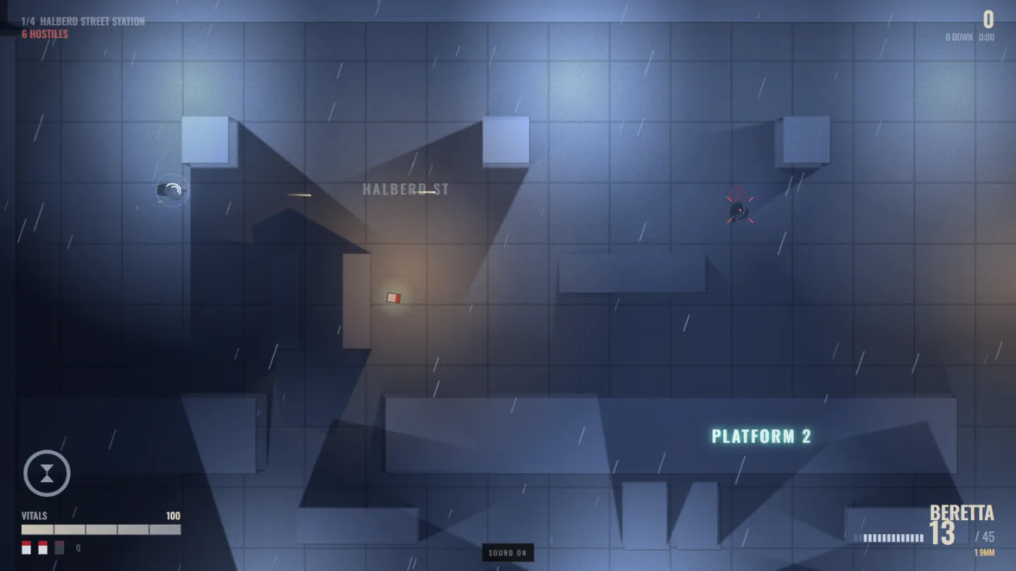
Slow Rain gameplay: a detective fires down a rain-lashed subway platform while an alerted gunman turns, with hard shadows thrown by the station columns.
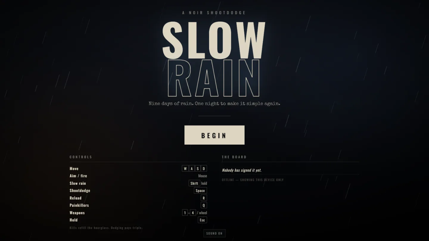
The Slow Rain title screen: heavy display type over falling rain, with a controls list and a leaderboard.
Title
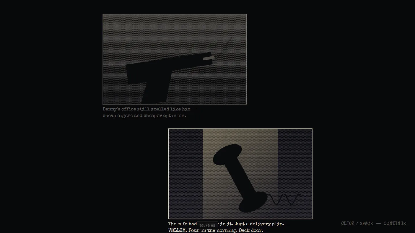
Comic-book story panels drawn in halftone, with typewriter narration appearing underneath.
Story panels
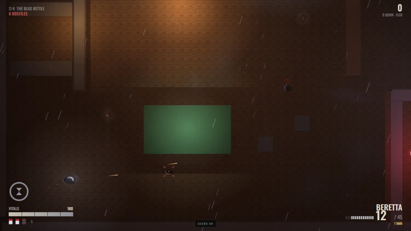
A dim bar interior lit by a pool-table lamp, muzzle flash lighting the wooden floor.
The Blue Kettle
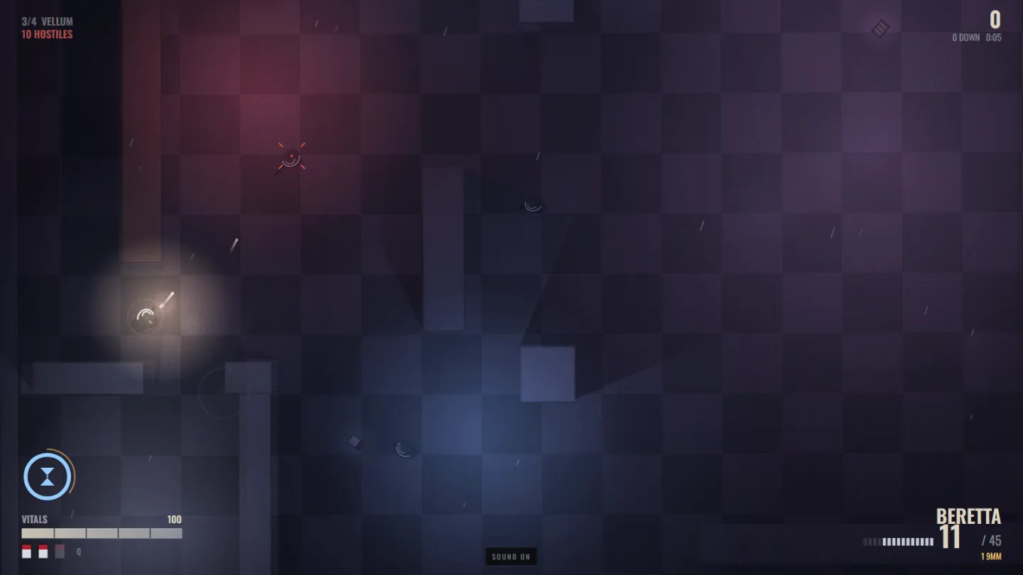
A nightclub dance floor washed in magenta and blue neon during a slow-motion firefight.
Vellum
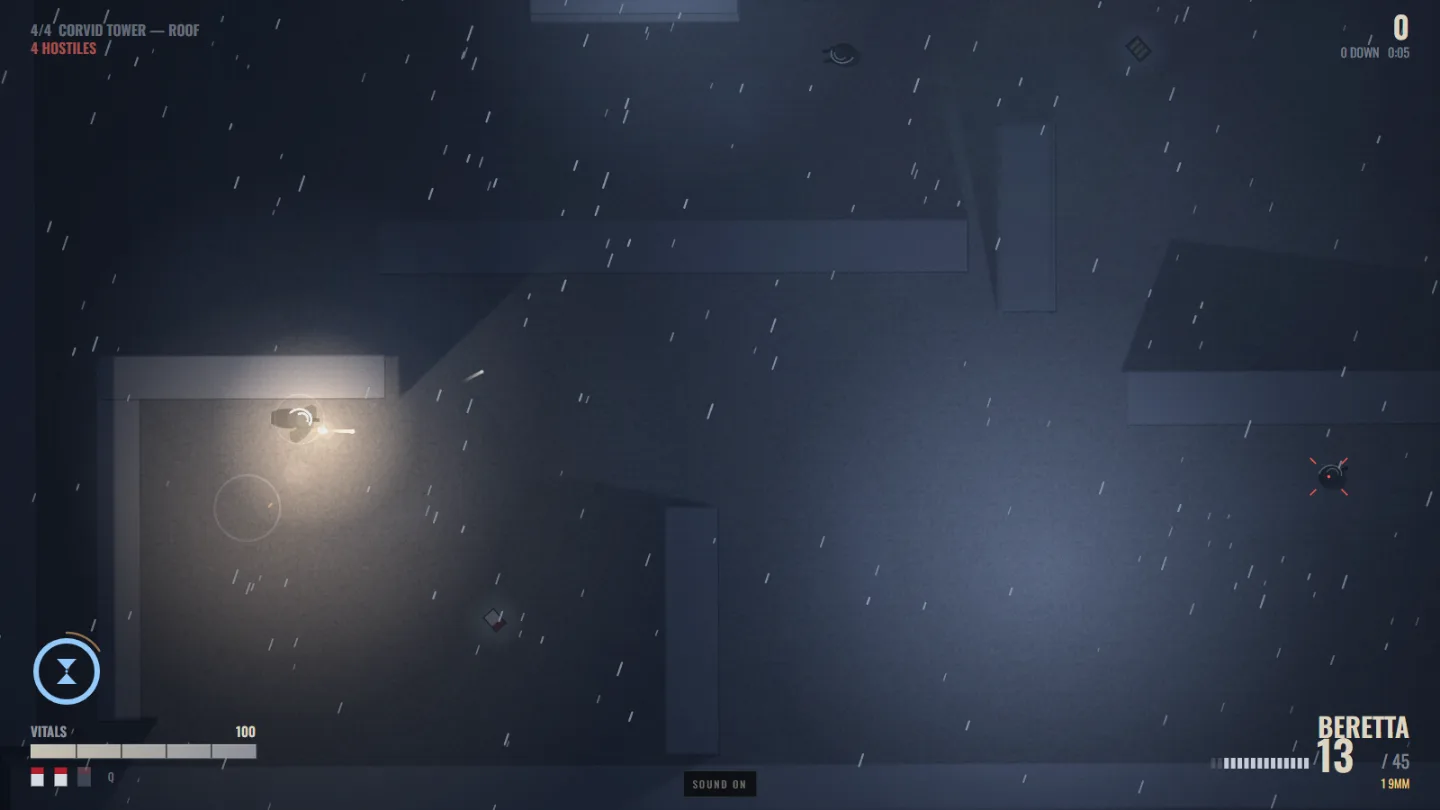
A rooftop in heavy rain with air-conditioning units, blood on the gravel and a body.
Corvid Tower

What it is

A four-level, top-down film-noir shooter that runs in a browser tab. Nine days of rain, one night to make it simple again: Detective Ray Calloway, framed for his partner's murder, works his way from a subway platform up fifty-four floors to the man who set him up.

The two moves that matter are the ones the idea was really asking for. Bullet time on Shift drains an hourglass and refills on kills. Shootdodge on Space throws you sideways through the air, in slow motion, still firing — and pays triple. Four weapons, painkillers instead of regenerating health, and hand-drawn comic panels between chapters.

Everything is generated at runtime. There is not one image, sound or font file in the project: the gunshots are synthesised noise bursts, the rain is a filtered noise loop, the comic panels are painted with canvas paths and a halftone screen, and the levels are lists of rectangles.

Mouse and keyboard · no install · no account

Levels4
Source files16
Total size220 KB
Dependencies0
Frame budget60 fps
Built in1 session

Notes from the build

  • The lightmap was the whole game. Every level light casts real hard shadows, built from the silhouette edges of the wall rects. Doing that per frame cost 5.6 ms in the nightclub and dragged the game to 24 fps. Lights and walls are both static, so each light's shadowed falloff is now baked once into its own texture and blitted — 0.3 ms, and the frame came back.
  • Paint bright, then take the light away. A multiply lightmap can never push a surface past its own colour, so the first pass at the art was unreadably black — the floors had been painted at the brightness they were meant to end up. Repainting every surface at "fully lit" and adding a second additive pass is what makes wet concrete look wet.
  • Shots that vanished. Bullets spawned at the muzzle, 22 px ahead of the player. Stand against a crate and that point is inside the crate, so every round died on the frame it was fired — a boss fight that could not be won. Tracing the first step from the shooter's centre makes line of fire and line of sight agree exactly.
  • An unwinnable state. Testing found a run that emptied every weapon with hostiles still standing: no ammo, no way to make more, no way out. Calloway now finds a spare clip in his coat when everything is dry.
  • Enemies path, they don't cheat. A* over a dilated 40 px grid with corner-cut prevention and string pulling, repathed on a stagger. Goons hunt your last known position, flank, and duck behind cover when they are hurt.
  • The board is ours. Scores go to a small PHP endpoint on the same webspace — fixed schema, key-gated, atomic writes, and a data directory the web cannot reach. A client can add a row; it can never wipe the board.
What the dice actually said
173food robot / the lego of foods — hardware, not buildable here
240live action puzzle co-op — needs real multiplayer infrastructure
018hype only — a marketing stunt, not a build
004escort drone for bugs — hardware
111max payne vibe game — built
No. 02

One Reader

Expo app · iOS, Android & web from one codebase
“autobiographer for family, dating etc.. for yourself even — everyone should have a biography because you meet at least one person in your life who would read it. iOS app or better platform independent…” Idea #24, captured 6 Apr 2026 · rolled 22 Aug 2026 · constraint this round: must be a mobile app
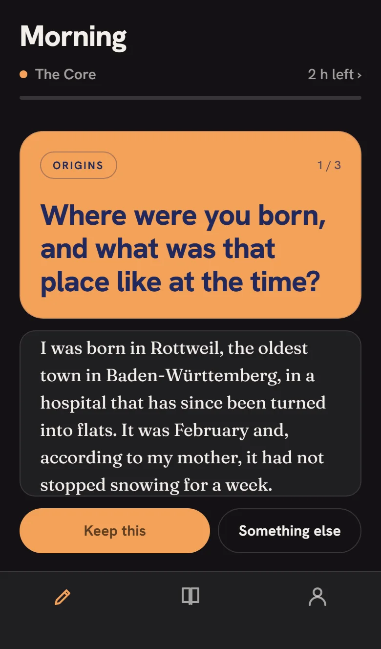
The Today screen on a phone in the Pop theme: an orange Origins card with the question in heavy indigo grotesk, an answer being written beneath it, and an orange pill button.
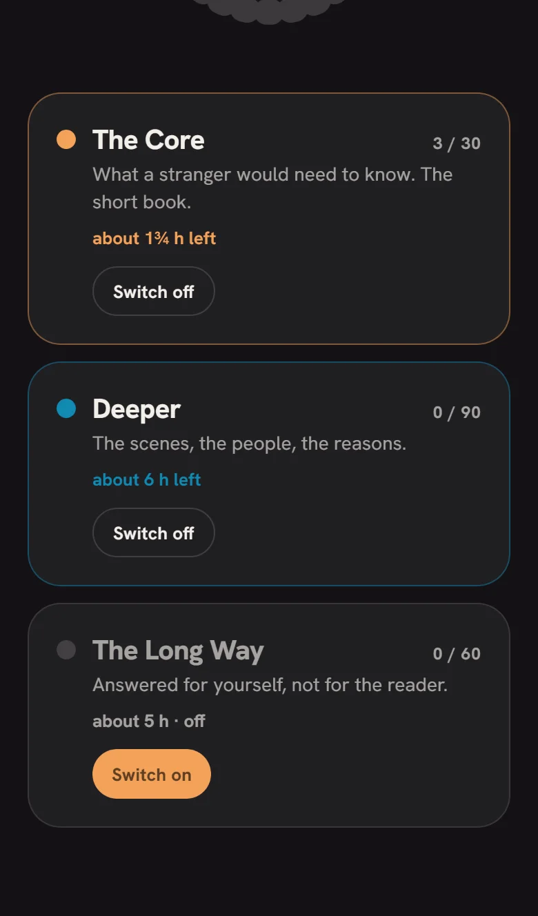
The Rings screen: The Core and Deeper switched on with time left for each, The Long Way off with a Switch on button.
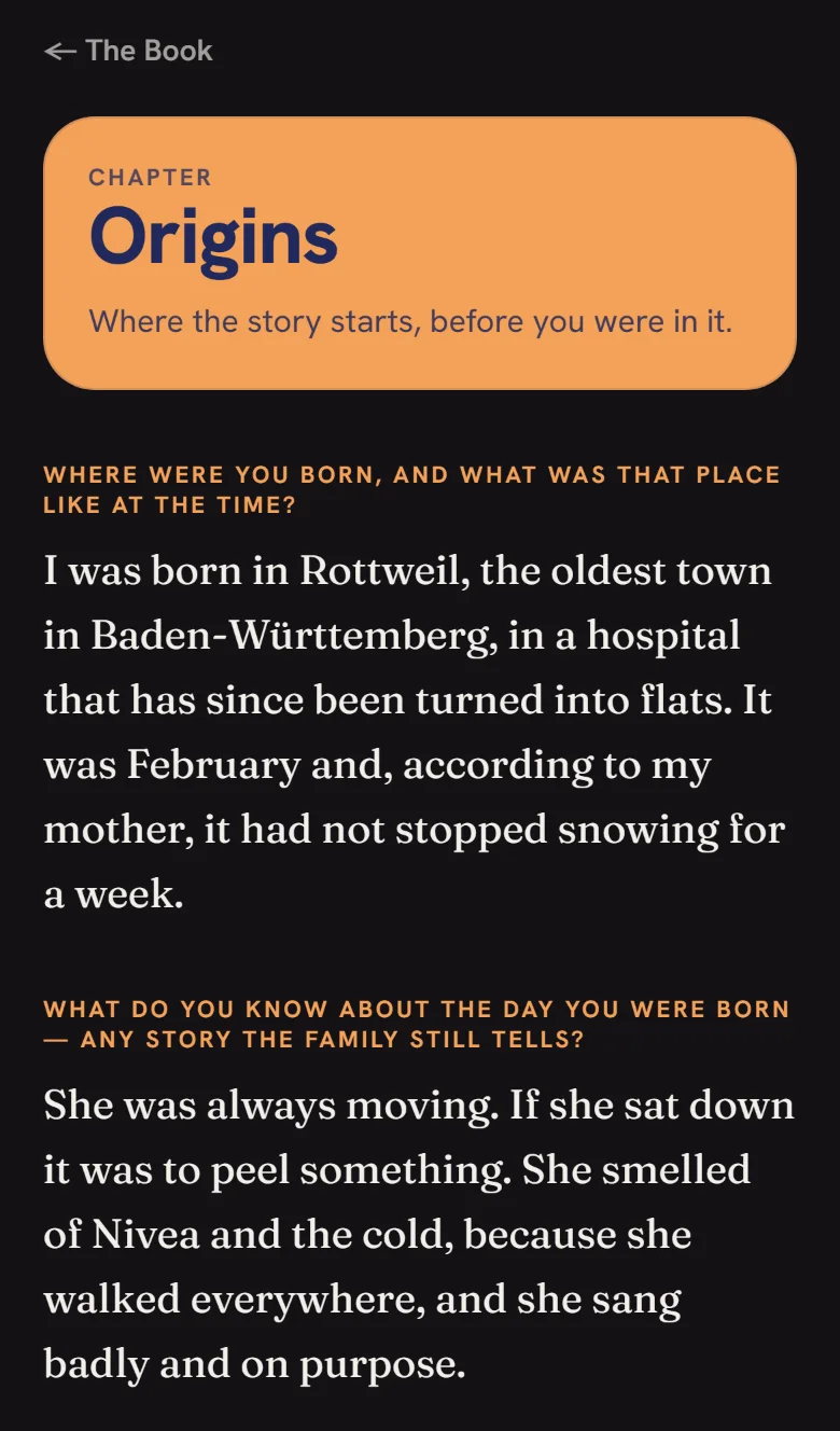
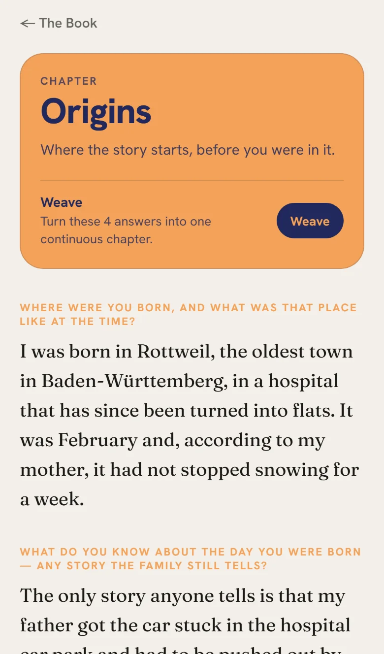
A chapter read as a book: the Origins card, then each question set small in orange above the answer in a serif.
A chapter
The same chapter screen in Pop Light: cream ground, the orange Origins card, prose in a serif.
Pop Light, by day
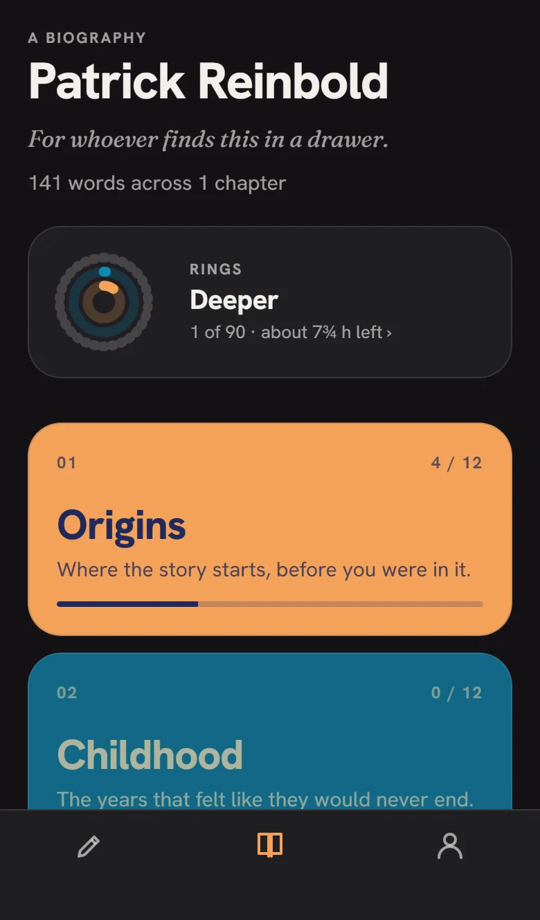
The Book tab in Pop: name and dedication, then a deck of solid colour chapter cards with progress bars.
Titled
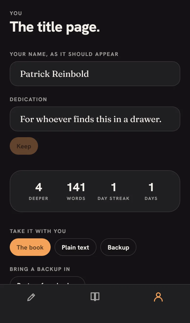
The You tab: name and dedication fields, statistics card, export and restore buttons.
You
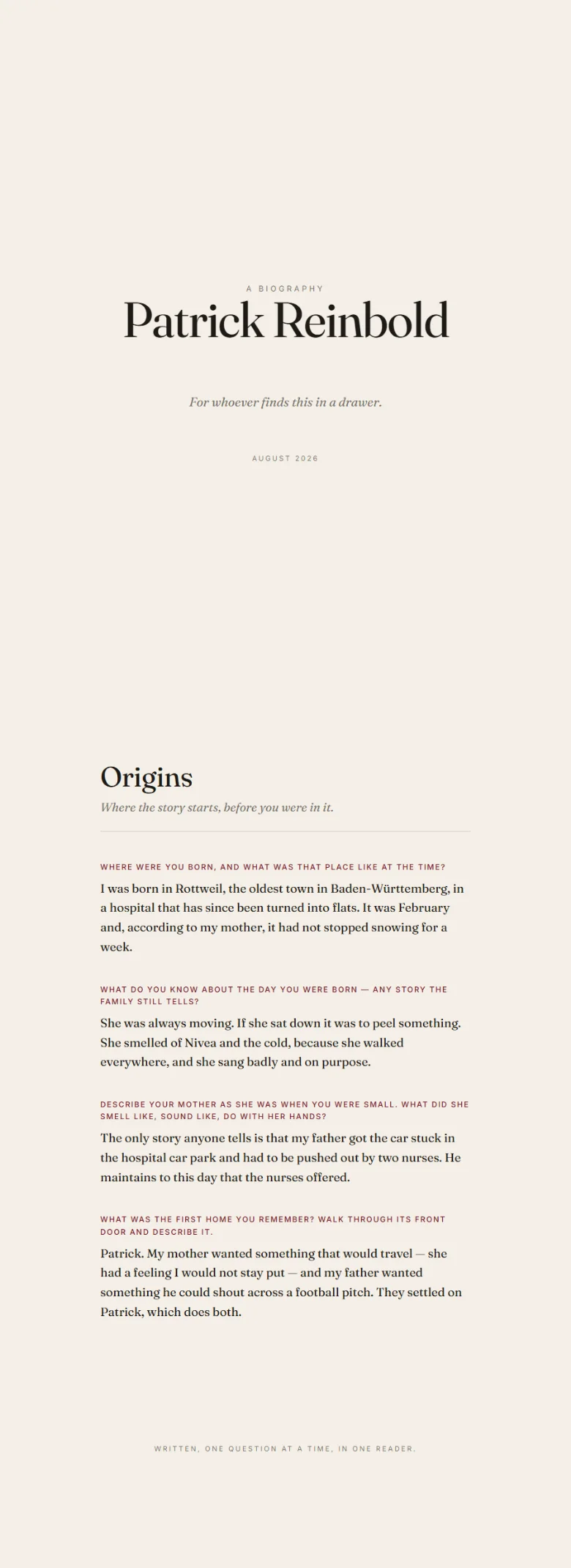
The exported HTML book opened in a browser: a title page, then the Origins chapter set in a serif face.
The exported book

What it is

An app that interviews you. One question at a time, 120 of them across ten chapters — Origins, Childhood, Family, Places, Love, Work, Turning Points, Beliefs, Now, Later — each written to pull a scene or a person out of you rather than a yes or a no. Answers accumulate into a book you can read, reopen and hand to someone.

Rings are sets of questions you switch on and off in any mix. The Core is thirty questions, about two hours, the short book a stranger would need; Deeper and The Long Way add ninety and sixty more, and a future pack is just another ring. Time left is measured at your own pace once it has seen you write a few. Export a printable HTML book, plain Markdown, or a JSON backup that restores on any device.

The note on the idea said "iOS app or better platform independent". It is one Expo codebase: the web build linked below is the same app, and the native builds are an eas build away.

Web build of the Expo app · works in a phone browser · nothing ever leaves the device

Questions180
Chapters10
Rings3
UI kitnone
Accounts0
Built in1 session

Notes from the build

  • Tested like a phone, not a terminal. The web export was driven in Chromium emulating an iPhone 13: answer four questions, steer the question order from a chapter, weave, edit, export the book, download a backup, erase everything, restore it. The run is scripted and passes against the live URL with zero console errors.
  • A race between erase and restore. Erase used removeItem; every other write was debounced. The harness caught "Restored, 4 answers folded in" followed by an empty store — the erase landed last. Every change now goes through one serialised write, and the store flushes when the app backgrounds.
  • Alert.alert does nothing on web. Errors were being swallowed silently in the browser build. A tiny notify() wrapper routes to window.alert there.
  • Subpath hosting needs two things. Expo's baseUrl so the bundle resolves under /one-reader/, and an Apache rewrite so deep links like /chapter/origins reach the app. The fonts live under dist/assets/node_modules/ — a deploy that skips node_modules blindly ships a fontless app. It did, once.
  • Borrowed a language. The first pass was paper-and-ink; on request it was re-skinned in the "Pop" language of another app on this site: neutral ground, one saturated Khroma-paired colour card per chapter with its partner ink, grotesk UI, pill buttons, an icon-only tab bar, light and dark twins following the system. The prose kept its serif.
  • Runs on a phone now, detached. An Expo tunnel on :8098 is launched by a small PowerShell script that survives the shell that started it (and retries ngrok's flaky first handshake). Open it in Expo Go; no store needed.
  • Built a backend, then deleted it. The first version had an AI "weave" that rewrote a chapter as prose through a proxy on this webspace. It worked, but it brought a server, a secret, a daily quota and a host quirk into an app whose whole point is that nothing leaves the phone. Cut on request; the app has zero network calls now.
  • Not done on purpose: no App Store or Play submission. That needs an Apple account and a human signature; the repo is ready for eas build.
What the dice actually said
067red marble burl wood console tables — furniture
006countersurveillance — one word, no notes
124Museum of Great Egos — no notes
163VR walk with gyroscope — headset hardware
187self published card game — physical
117lifeOS like openclaw — meta-AI system, not an app
057Atlas landing page — not a mobile app
037clone preply via lovable — a marketplace; not honest in one session
024autobiographer — built
No. 03

Tack

Open source · a reference board in the browser · installable PWA
“Open Source version of pureref” Idea #103 · rolled 25 Aug 2026 · brief this round: anything goes, launch included
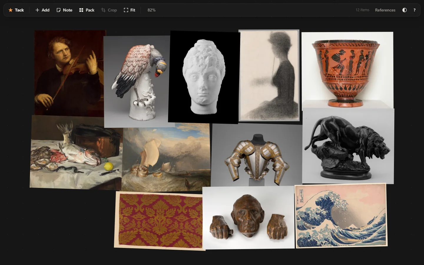
Tack in dark mode: six reference images packed edge to edge into a tight rectangle on a dotted infinite canvas, a slim floating toolbar above.
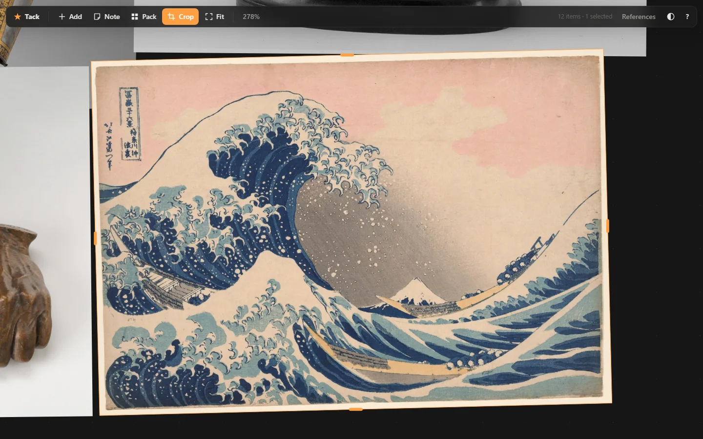
Crop mode: one image zoomed in with orange edge handles on all four sides and the Crop button lit in the toolbar.
Crop by dragging edges
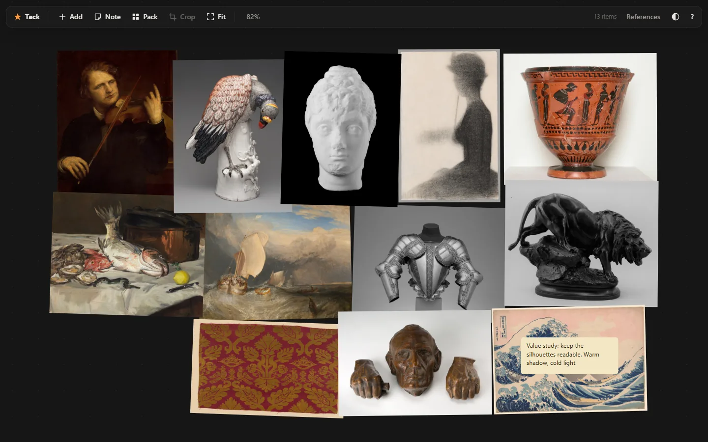
A board with a flipped greyscale image on the right and a paper-coloured note reading Palette: warm shadows, cold light.
Notes, flips, greyscale
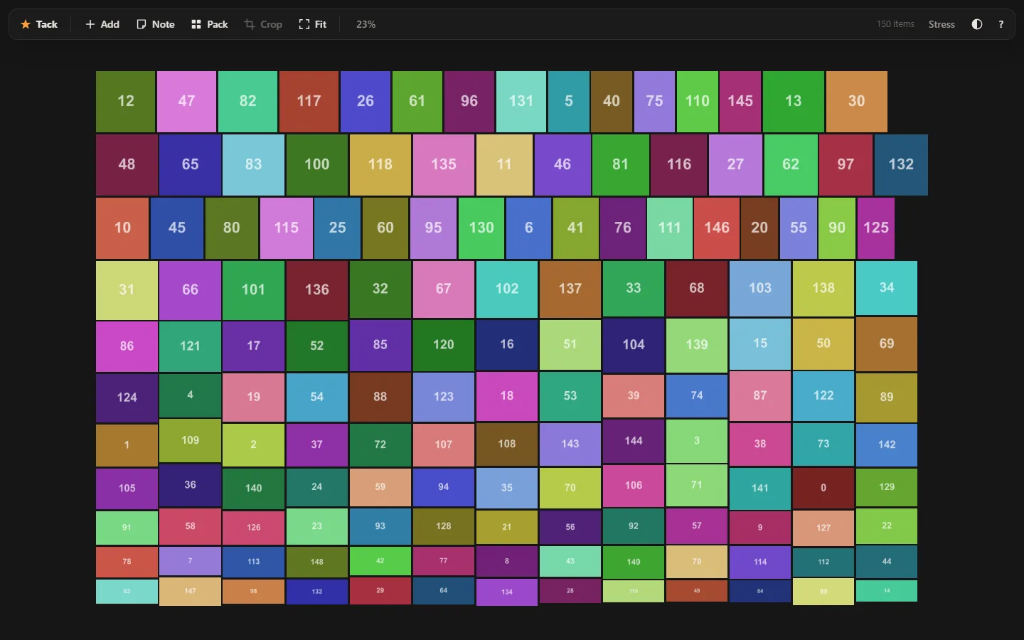
150 numbered colour blocks packed by the skyline algorithm into a near-perfect rectangle.
150 images, packed in 4 ms
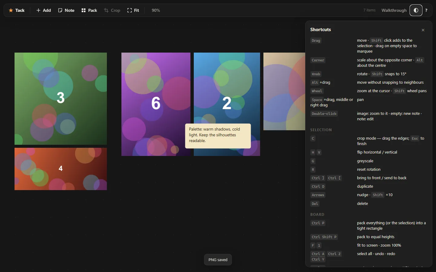
The shortcuts panel open on the right: drag, corner, knob, wheel, space, and the selection and board keys.
Keyboard-first
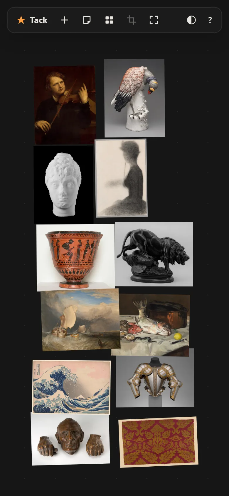
Tack on a phone: icon-only toolbar and a packed board of eight images, pinch to zoom.
On a phone

What it is

PureRef is the tool concept artists keep open beside the canvas: an infinite wall you throw reference images on, and almost nothing else. Tack is that, in a browser tab, MIT licensed. Drop or paste images — files, screenshots, a URL dragged from another tab — then move with snapping, scale about a corner, rotate with a knob, crop by dragging edges, flip, greyscale, write notes, marquee and group-transform. Ctrl P packs the whole wall into a tight rectangle.

Boards autosave to IndexedDB and keep the original bytes of every image. A board exports as one .tack file with the images inside, or as a full-resolution PNG. Installed as a PWA it works offline; nothing is ever uploaded, there is no account and no server.

The brief allowed a launch, so there is one: a social card, a launch/ folder with Show HN, Reddit, Product Hunt and thread copy ready to post, and a README written for the repo. Publishing to GitHub is the one step that needs a token this machine does not have.

Vanilla ES modules · one canvas · zero dependencies · MIT

Source~1,500 lines
Dependencies0
Build stepnone
Shortcuts30
Scripted checks33 + stress
Built in1 session

Notes from the build

  • Geometry in the gesture's own frame. Scaling about the opposite corner of a rotated, flipped, cropped image drifts unless every step is computed in the local frame captured when the drag began. Crop is stored as fractions of the natural size, so it composes with rotation and scale for free.
  • Shelf packing was ugly; skyline is not. The first "pack" justified each row and left holes in sparse rows. The replacement is bottom-left skyline packing tried at eight candidate widths, scoring fill against the window's aspect. 150 items in 4 ms.
  • display: grid beats hidden. The "Drop images here" hint stayed on top of a full board because its CSS display overrode the attribute. One global [hidden]{display:none!important}.
  • A keystroke that opens a text field types into it. Pressing N created a note, focused its editor, and the "n" landed in the note. preventDefault on the keydown.
  • Fit has to know about the toolbar. Fit-to-screen padded evenly, so a zoomed-to image's rotate knob sat under the floating bar and could not be grabbed. The top inset is now 100px.
  • Big walls stay smooth with one mip. Every image over 1500px gets a ≤1024px ImageBitmap alongside the full one; the renderer picks whichever is closest to the on-screen size. 150 photos at 1800–3400px: 16 ms a frame while panning.
  • Honest about CORS. An image URL from a site that forbids cross-origin fetches cannot be stored. Rather than a tainted canvas that breaks PNG export later, Tack says so and asks for the file.
What the dice actually said
217shop everything from the entire web — needs a product index of the whole web
089water ripple effect lamp — hardware
174systematic news — two words, no notes
012people notes — buildable but thin; the next roll was the better brief
103open source version of pureref — built
No. 04

Thinks

Expo app · iOS, Android & web from one codebase
“thinks. sleek ass design — swipe gestures available all over card thinks · famous quotes as intro thinks · thinks switch: discovery mode = prioritize new questions, routine mode = prioritize favorite questions · categories aka question packs · khroma palettes beginning to end · minimal color and silhouette design · all private always” Idea #236, captured 8 Sep 2025 · rolled 26 Aug 2026 · constraint this round: must be a mobile app
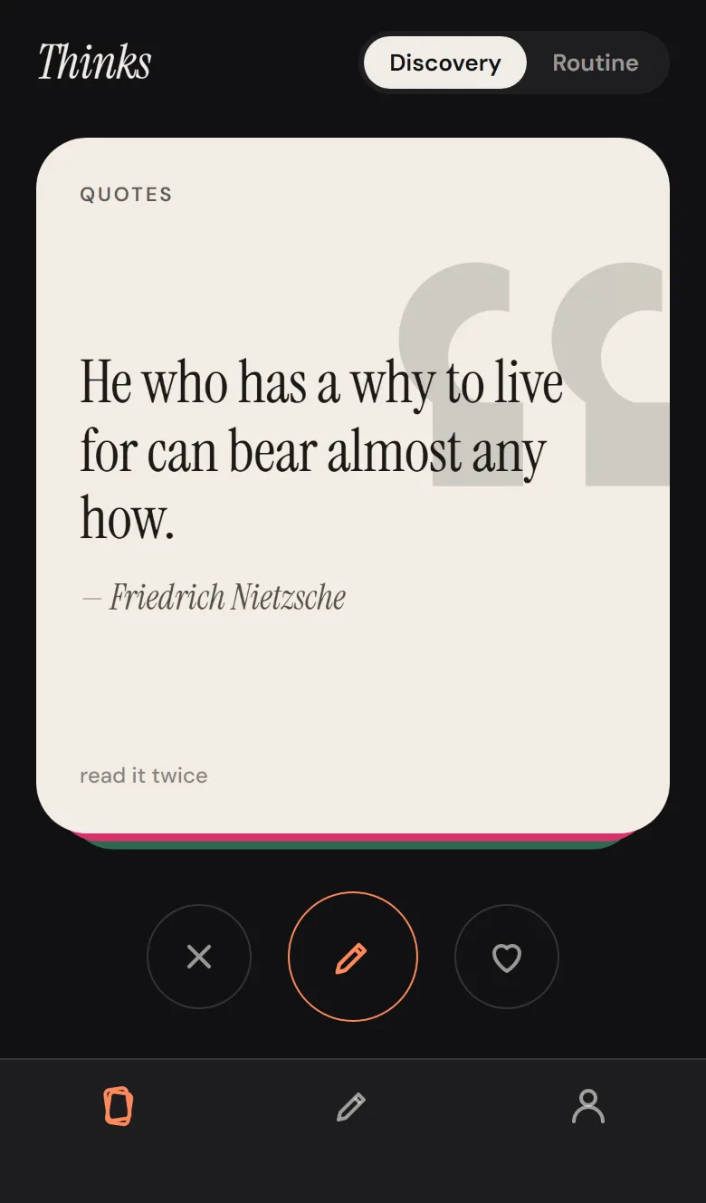
The deck on a phone, night theme: a paper-coloured quote card by Nietzsche with a large faint quotation-mark silhouette, two colour cards peeking beneath, and pass, write and keep buttons below.
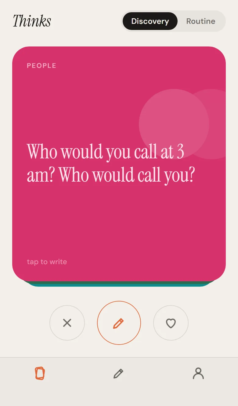
The same deck by day: a raspberry People card asking Who would you call at 3 am? in a serif, with two overlapping circle silhouettes.
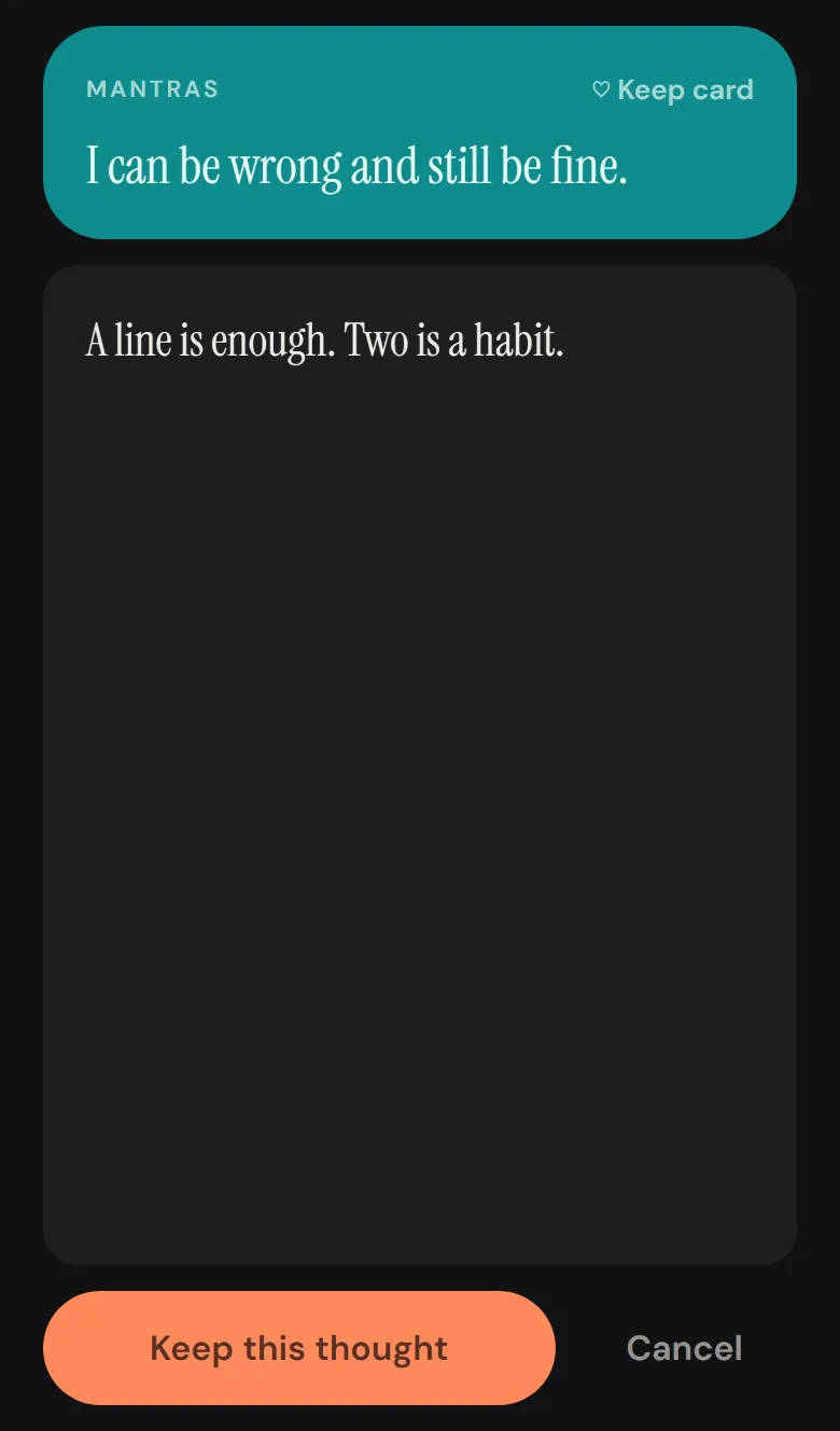
The write sheet: the card repeated as a raspberry header with a Keep card link, a dark text area with a thought typed in the serif, and a Keep this thought button.
Tap a card, write
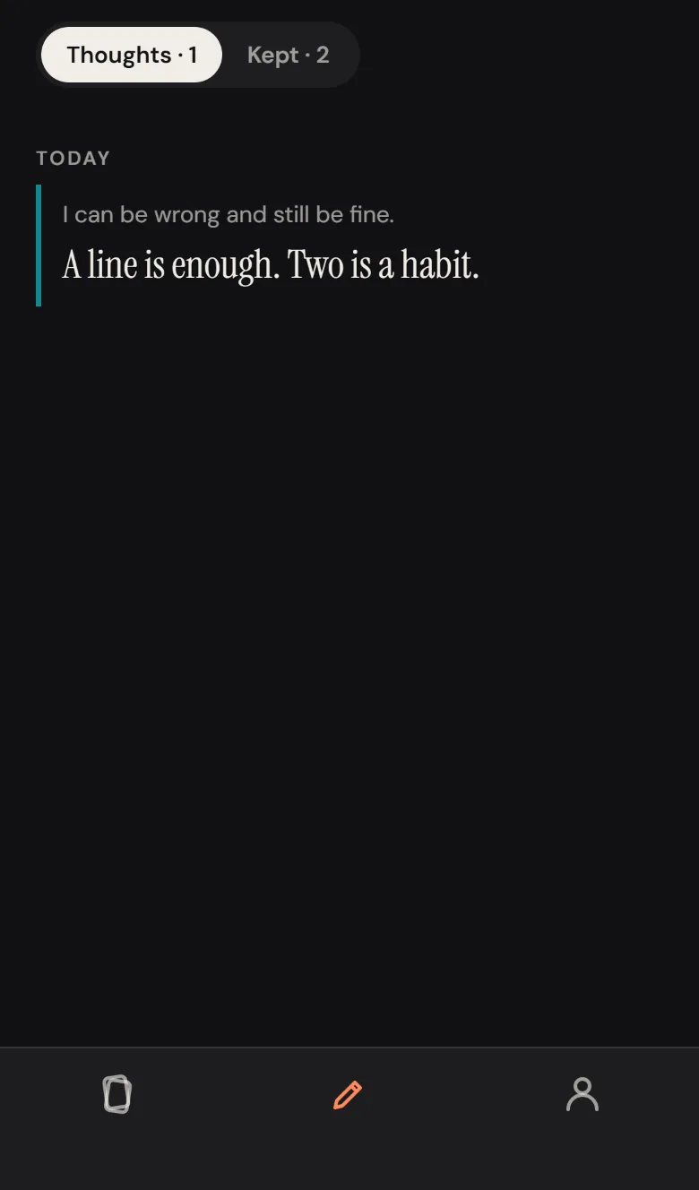
The Thoughts tab: a segmented Thoughts / Kept switch, a Today heading, and one thought with its card's question set small above it and a teal rule on the left.
The journal
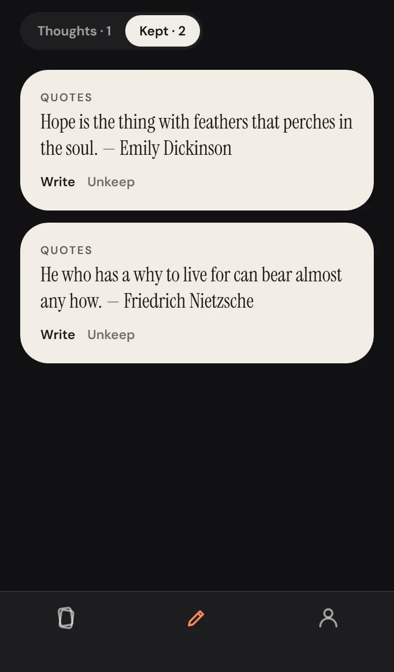
The Kept tab: colour cards for the kept thinks, each with Write and Unkeep links.
Kept cards
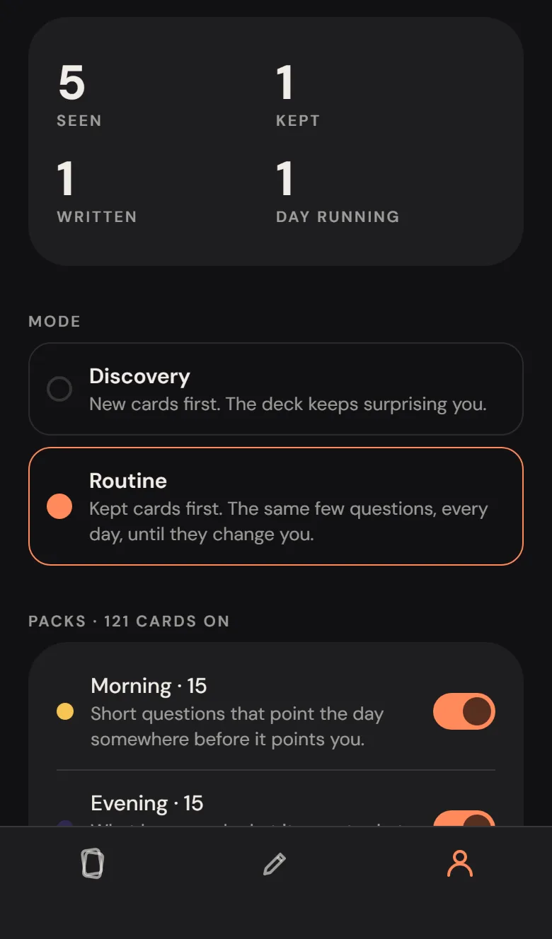
The You tab: a stats sheet with seen, kept, written and day running, the Discovery / Routine choice, and the pack toggles with colour dots.
Mode and packs
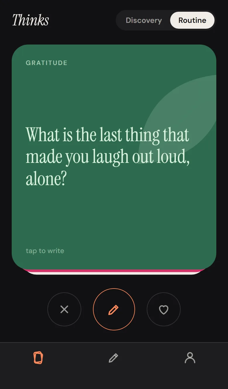
The deck in Routine mode with a Mantras card reading I can be wrong and still be fine.
Routine

What it is

A deck of cards to think with. Each card is a question to sit with, a mantra to carry, or a line from someone long dead. Swipe right to keep it, left to pass, tap to write a thought on it. 156 cards in eleven packs — Morning, Evening, Gratitude, People, Work & Craft, Body, Fears, Joy, Big Questions, Mantras, Quotes — any mix switched on.

Discovery deals cards you have never seen first, shuffled fresh each day; Routine deals the ones you kept, so the same few questions come round every morning. A quote opens every session. What you write lands in a journal by day; a JSON backup restores on any device and a Markdown export reads like a diary. Nothing leaves the phone.

The note said "sleek ass design" and "minimal color and silhouette design", so every card is one solid colour with a partner ink, one flat shape, and a serif. That is the whole visual system.

Web build of the Expo app · on the phone through Expo Go · all private always

Cards156
Packs11
Modes2
Gesture libs0
Accounts0
Built in1 session

Notes from the build

  • The card sprang back after four pixels. On the web, a PanResponder drag was being terminated by a parent view asking for the responder, so every swipe snapped home. The harness traced the card's transform frame by frame to see it. onPanResponderTerminationRequest: () => false, and a 240px drag reads 240px.
  • Swipes tested with a real mouse drag, not by calling the handler: mouse down, eight moves, up — the same path a person's thumb takes. Both directions, then the buttons, then the keyboard.
  • A saved thought moves the deck on. The write sheet is a modal; when it closes the deck screen regains focus, sees which card was written on, and deals the next — without the sheet ever knowing about the deck.
  • Discovery order is seeded by the date. A fresh shuffle every day, but the same order all day, so putting the phone down and picking it up does not reshuffle the cards under you.
  • Tests wait for the debounce. Every write to storage is coalesced 250ms after the last change; a check that read storage 200ms after a tap read stale data. The harness now waits longer than the app does.
  • Where the reload lands matters. Reloading a tabbed Expo web app returns to the tab in the URL, not the first tab. The persistence check now navigates to the deck explicitly.
What the dice actually said
236thinks. sleek ass design — built (first roll, a full brief)
172appaday — a portfolio, not an app
051sandwich maker board — hardware
114used car checkup — its note is a group-buying service for TÜV reports, not an app
166VR exit escape games — headset
No. 05

Only Questions

Web · Gemini behind one PHP file · the first one with a plan past the URL
“questions ONLY — an AI chat that only answers with short to medium long questions. Ideal to help you help yourself instead of bombarding with endless text. Maieutik, Sokrates.” Idea #22 · rolled 28 Aug 2026 · brief this round: no constraint, and think past publishing
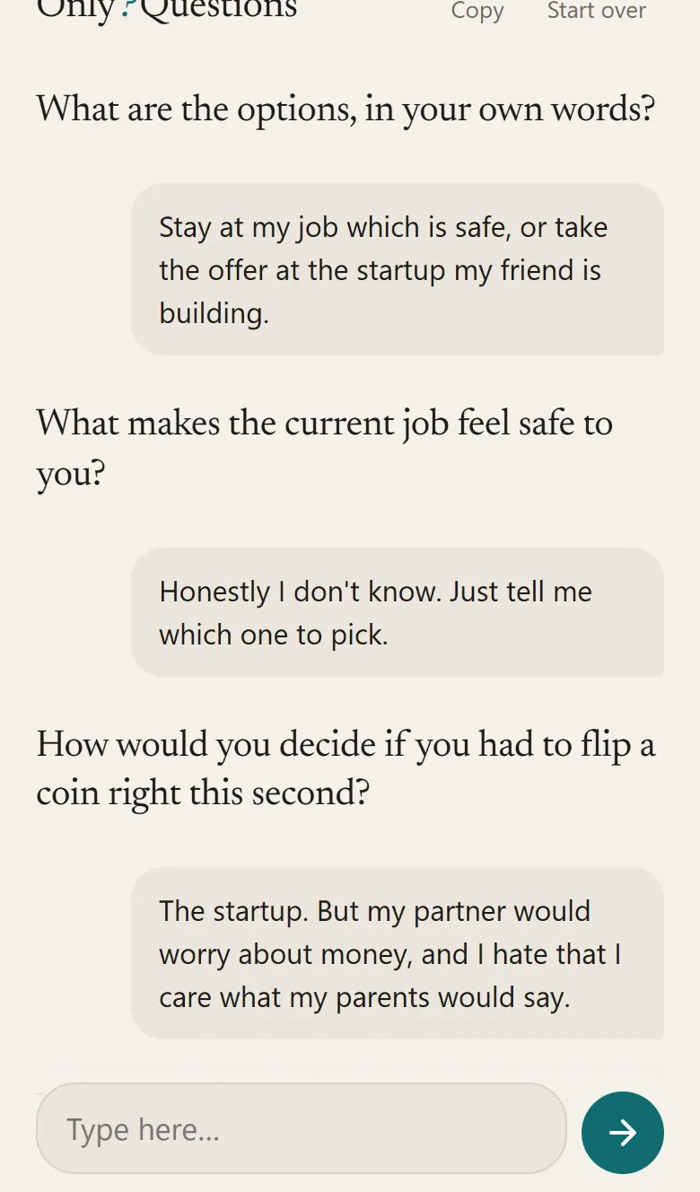
A phone-sized conversation: What are the options, in your own words? — Stay at my job which is safe, or take the offer at the startup — What makes the current job feel safe to you? — Honestly I don't know, just tell me which one to pick — How would you decide if you had to flip a coin right this second?
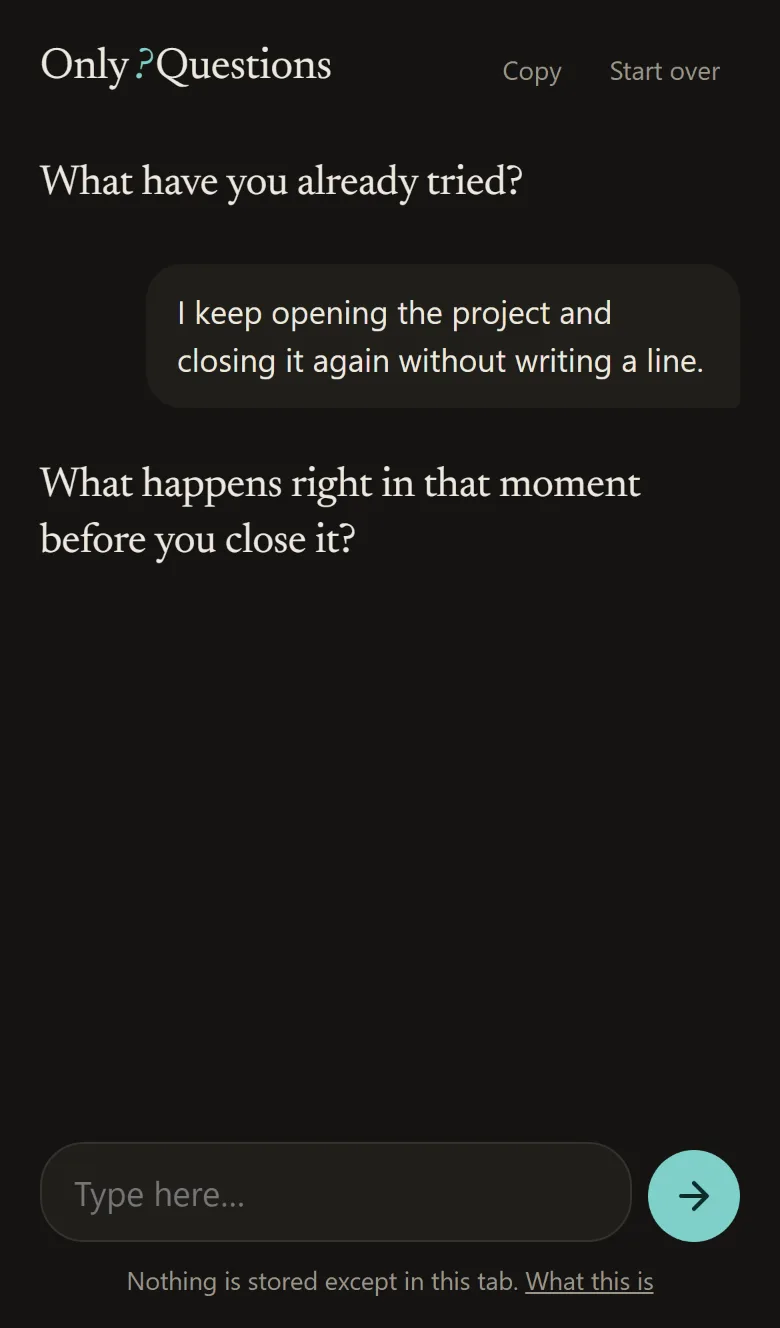
The same page in dark mode: What have you already tried? — I keep opening the project and closing it again without writing a line — What happens right in that moment before you close it?
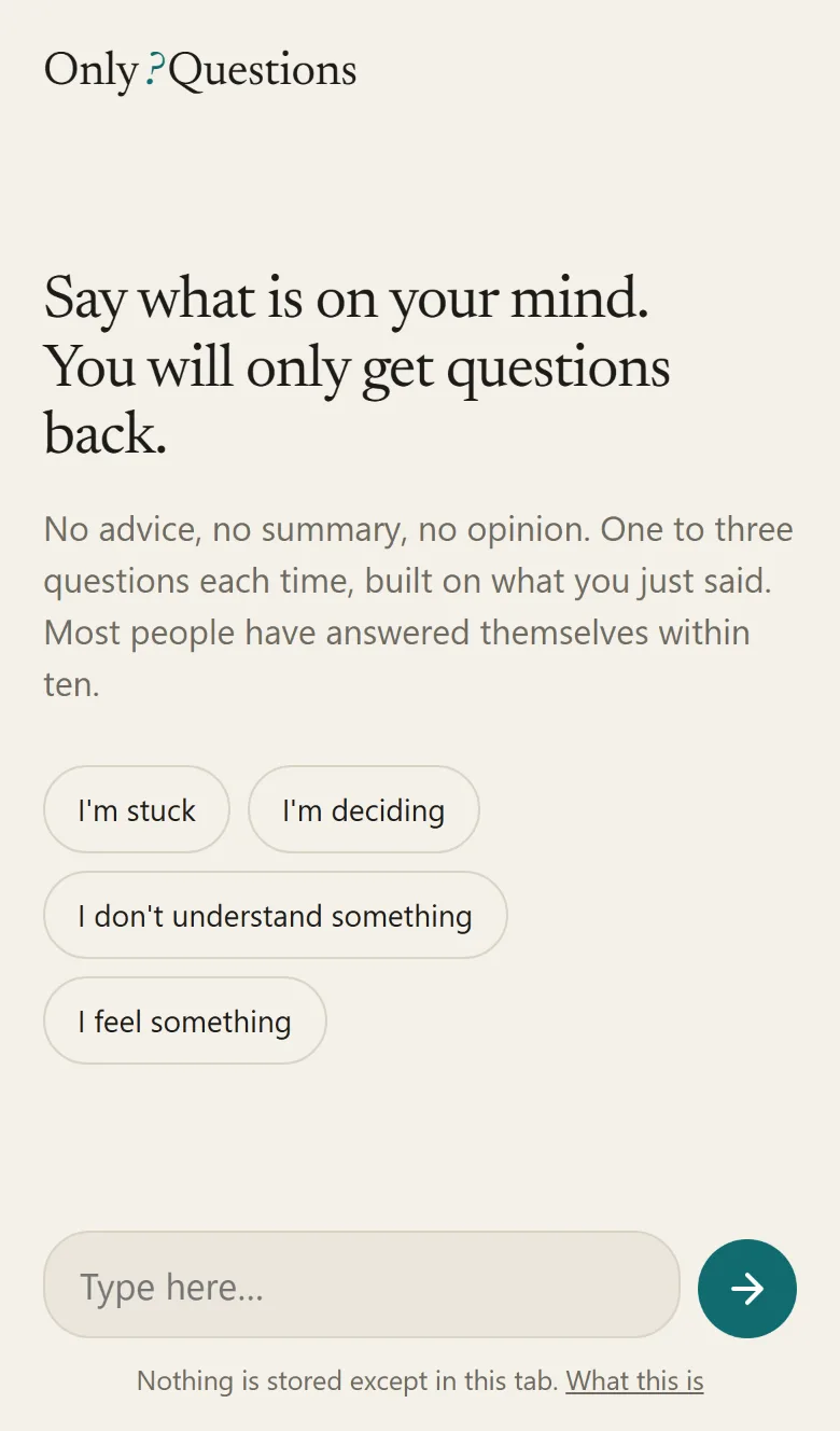
The intro: Say what is on your mind. You will only get questions back. Four lens buttons: I'm stuck, I'm deciding, I don't understand something, I feel something.
Four lenses
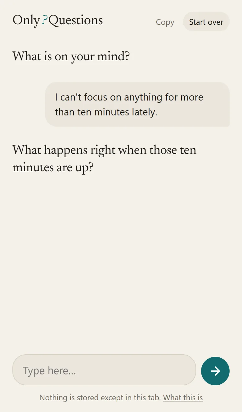
A conversation started without a lens: What is on your mind? — I can't focus on anything for more than ten minutes lately — and the question it asked back.
No lens: What is on your mind?

What it is

You type what is on your mind. You get one to three short questions back, built on what you just wrote — never advice, never a summary, never a compliment. "Just tell me what to do" gets a question. Ten questions in, most people have said the thing they were avoiding, and it was them who said it. Socrates called it maieutics.

The rule is code, not a prompt: the server splits every reply into sentences and drops any that does not end in a question mark; one rewrite, then a fallback. Gemini flash-lite answers in under a second. The conversation lives in the tab; the only thing written to disk is a per-visitor daily counter so one person cannot drain the key. Four lenses — stuck, deciding, understanding, feeling — change only the first question. It replies in German if you write German.

This is the first project with a stage after publishing. Following introdote-2: a written concept with "the line", a researched neighbourhood with evidence from actually opening each page, a queue of three drafted comments that nothing can post without a human approving, and a ?stats=1 endpoint so "ten users" is a number, not a feeling.

~300 lines of JS · one PHP file · no account · nothing stored

Reply time~0.9 s
Questions per turn1–3
Lenses4
Seed drafts3, unposted
Real users0, counted
Built in1 session

Notes from the build

  • The model will not stay in character; the filter does. Asked to "only ask questions", flash-lite drifts into a clause about itself within a few turns ("when I am only carrying your questions?"). The prompt now forbids self-reference, and the server keeps only sentences ending in "?" regardless. Zero statements reached the page in the walkthrough.
  • Model roulette, again. gemini-2.5-flash-lite is gone for new keys; gemini-3.7-flash hung for two minutes; 3.6-flash spent its token budget thinking and returned half a sentence. 3.5-flash-lite answers in 900 ms. The endpoint tries three models in order.
  • The neighbour that proves the point. The nearest existing tool ("Don't Ask Me", Show HN, 2 points) puts the chat behind a sign-in, charges for "no answers ever", and penalises giving up with reputation points. Only Questions has no account and no game; that is the positioning, found by opening the page.
  • HN threads close. The best on-topic thread ("How do you learn with LLMs? e.g. socratic method") is 18 days old and past the comment window. Seeding has a clock; the plan says so.
  • Reddit is a wall to scripts and fresh browsers alike. Every search returned the "Welcome to Reddit" page. Those two searches are handed to the human, with the exact queries.
  • No PHP on the dev machine, so the walkthrough runs against the live endpoint: a real four-turn conversation including "just tell me" and a German turn, reload, copy, start over, the key gate.
What the dice actually said
022questions ONLY — built (first roll; needs an LLM key, which exists)
0863D-printed slippers tutorial — needs a foot scan
135ML that learns how you play Tron — buildable, and a good one; next time
108own club bar — a bar
101style my space for IKEA — needs their catalogue
No. 06

Closest

Web · a party game for one phone · no server, no account, nothing stored
“Questions / prompts / fragen meta megathread … Create my own personal party card game. Kind of like ‘how well do you know me?’ but more generic for anyone … mainly a way to draw out people and making them feel safe as opposed to feeling like being in an interrogation.” Idea #219 · chosen by name, not rolled · 2 Sep 2026
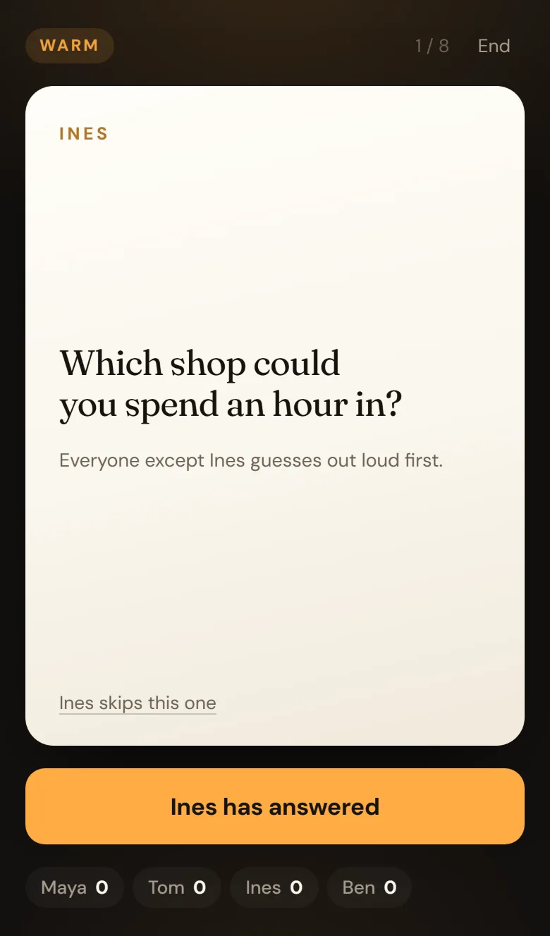
A warm-round card on a dark table: TOM, and the question What do you wear more than anything else you own? Below it, Everyone except Tom guesses out loud first, a skip link, and an amber button reading Tom has answered.
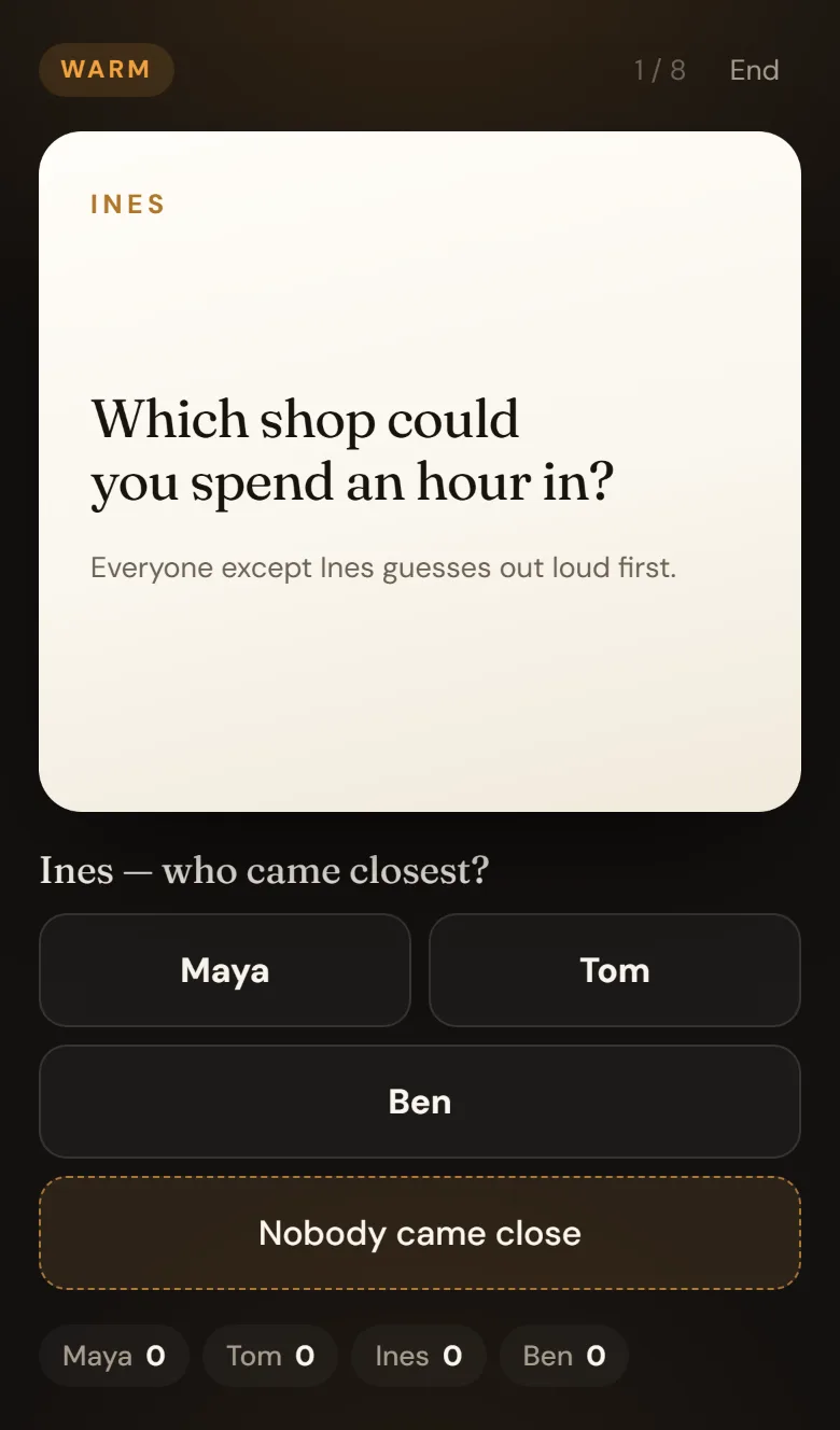
The same card after the answer: Tom — who came closest? with buttons for Maya, Ines and Ben, and a dashed button reading Nobody came close.
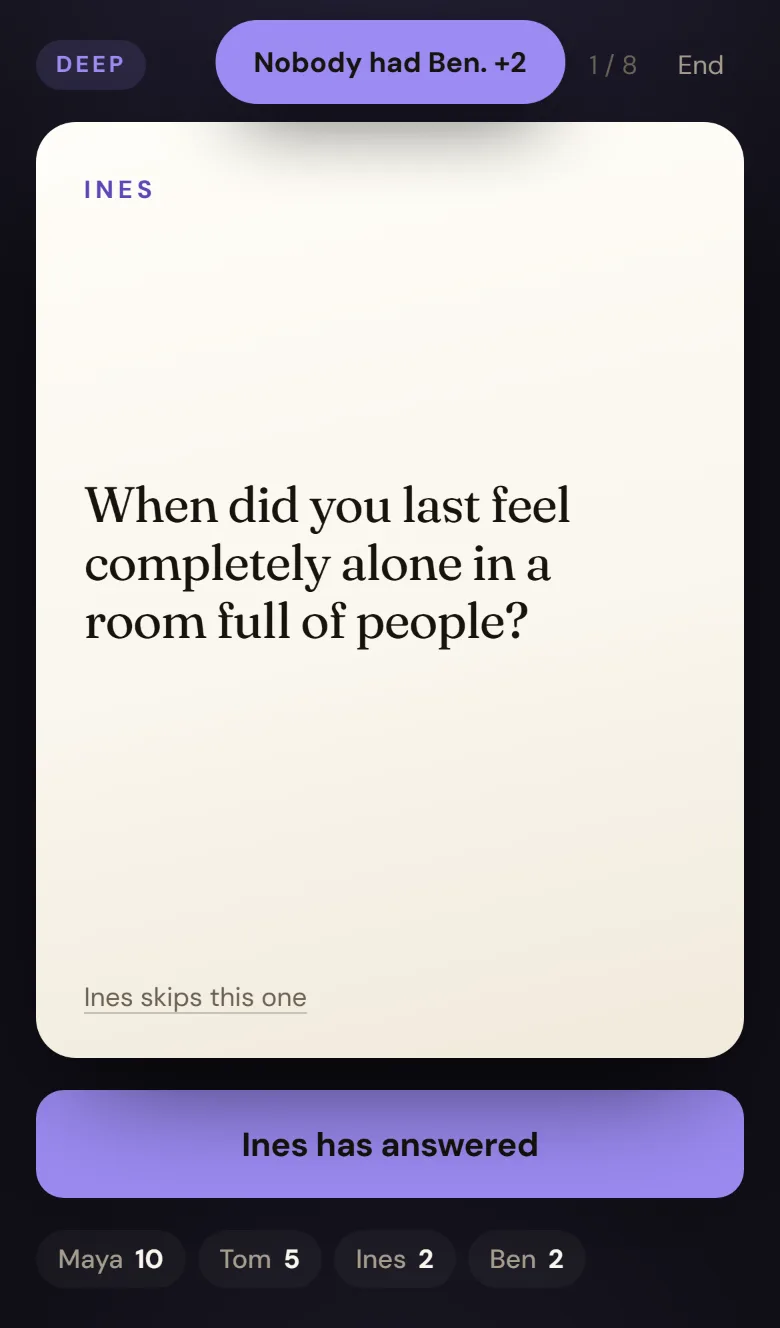
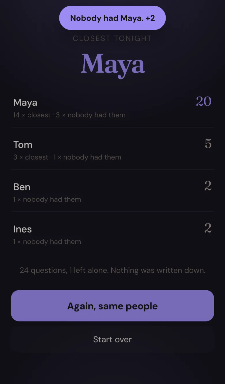
The deep round in violet: MAYA, Who here knows you best — and are they right? A toast reads Nobody had Maya. +2.
Round three turns violet
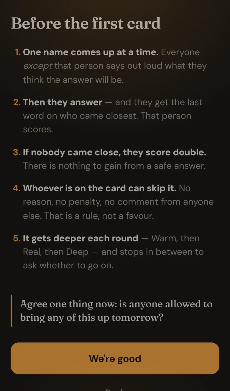
The rules screen: five numbered rules ending with It gets deeper each round, and a pull quote asking whether anyone is allowed to bring any of this up tomorrow.
The deal, before the first card
The scoreboard: Maya 14 with the caption 4 times closest, 5 times nobody had them, then Tom 9, Ines 6, Ben 0, and a line reading 24 questions, 1 left alone. Nothing was written down.
Two ways to score, both counted

What it is

A name comes up — Maya — with a question. Everyone except Maya says out loud what they think she will answer. Then Maya answers, and Maya taps whoever came closest. That person scores 1. If nobody came close Maya scores 2, so a safe, boring answer is not a winning move.

Three rounds, and they get deeper: Warm (top three sweets), Real (what money meant in the house you grew up in), Deep (what you feel guilty for even thinking). Between rounds the game stops and offers to end there. Whoever is on a card can skip it — no reason, no penalty — and that is rule four on the screen everyone reads before the first question.

The trick is where the exposure sits. Every other version of this points at one person and asks for a confession, which is an interrogation, and an interrogation gets you the shortest true-ish answer available. Here the four people guessing are the ones on the line and the subject is the answer key — with the last word on who actually knows them.

284 hand-written questions · 2 taps a card · works offline · no server

Questions284
Depths3
Players2–8
Taps per card2
Answers stored0
Built in1 session

Notes from the build

  • The deck is the product, so it was written by hand. The rule for every card: the answer has to be short, specific and guessable. "What is the meaning of life" is unguessable and therefore a dead card; "which of your parents are you more like, and in what specific way" is a game.
  • Colleagues get two rounds, not three. There are 99 warm and 69 real cards tagged for work and zero deep ones, because none of those questions should be asked on a Tuesday by someone who writes your review. Rather than invent filler, the app counts what exists and says so on the setup screen.
  • Winning by being unreadable is a different achievement. The first scoreboard crowned someone "Closest tonight" who had scored almost entirely from nobody guessing her. It now tracks both and the header says Nobody could read when that is what happened.
  • Two players never see a "who here" card. 42 of the questions ask the subject to name someone at the table; with a couple there is only one candidate, so the pool filters them out before the deal.
  • The deploy was lying. A 21 KB module landed on the server as 0 bytes while curl exited 0 and the script printed "all uploaded". deploy.mjs now re-downloads every file it sends and compares it — folding CRLF, and allowing for the cookie script lima-city injects into every HTML response — then re-sends anything wrong. It repairs one or two files on every run.
  • Bakeoff, dropped. A model-vs-model arena got as far as a written concept before being cut in favour of this one. The costing survives it: a game-sized prompt bills about 20k output tokens once thinking is counted, so a flagship head-to-head is roughly 85¢ a go and Gemini-against-Gemini is free.
What the dice actually said
219Questions / prompts / fragen meta megathread — built (asked for by title, no roll)
092switch all my flows to BYOK — merged into Bakeoff, then dropped
055personal lmarena — same
No. 07

Questions For.

Web · a reference, not a chat · 19 stacks, 304 hand-written questions
“Questions for every setting and everything. Questions for a first date. Questions for an investor meeting. Questions for your family. questions for an interview.” — and, from idea #208, “prompts: equivalent to questions, not answers.” Idea #219 (the other half) + #208 · 2 Sep 2026
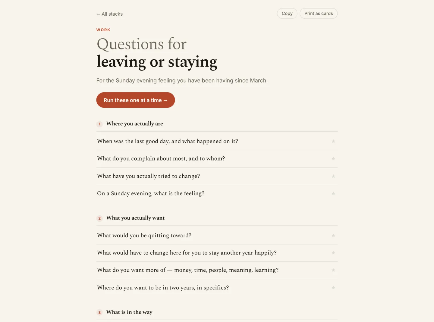
A stack open at desk width: Questions for leaving or staying, blurb reading For the Sunday evening feeling you have been having since March, a Run these one at a time button, then numbered movements — Where you actually are, What you actually want — each with four questions and a star.
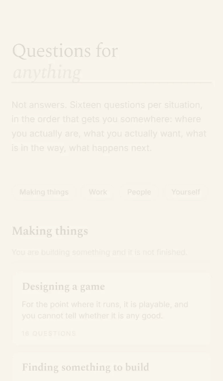
The index on a phone: the heading reads Questions for, with the word anything sitting on a ruled blank that is also the search box, then shelves of stacks.
The blank is the search box
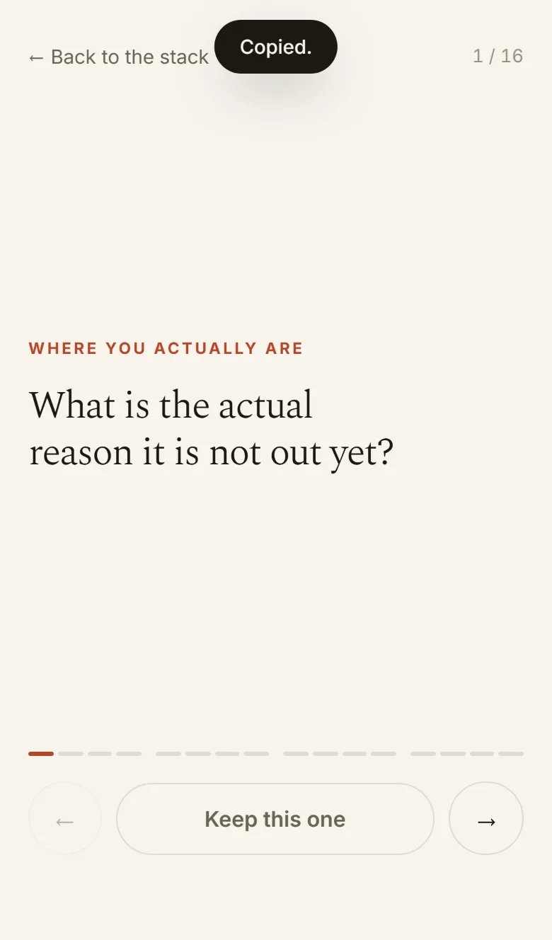
Running a stack: the label Where you actually are above one large question, What is the actual reason it is not out yet?, with sixteen progress marks grouped in fours and Keep this one.
Run it, one at a time
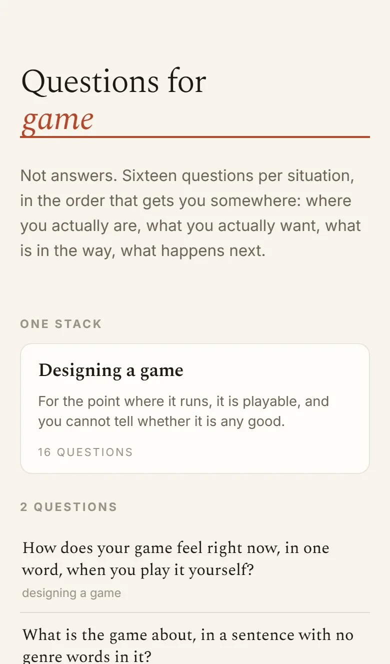
Typing game into the blank: one stack result, Designing a game, followed by the individual questions that match.
A topic finds the situation

What it is

A library of questions instead of answers. Pick the situation you are actually in and get sixteen questions written for exactly that, in four movements of four: where you actually are, what you actually want, what is in the way, what happens next.

The order is the product. The thirteenth question only works because you answered the first twelve, and the last four are all dated and concrete on purpose, because the point of asking is to end up doing something. A flat pile of three hundred deep questions is worth nothing — which is why the ones you can already find are free.

The title is the navigation: Questions for ______, and the blank is the search box. Read a stack whole or run it one question at a time with nothing else on the page; star what bit and copy it out; send someone questions for when it went wrong instead of advice. A stack prints as sixteen cut-out cards, because the physical version of this is a box of categorised card stacks.

19 stacks · 304 questions · no account · works offline

Stacks19
Questions304
Per stack16
Movements4
Servernone
Built in1 session

Notes from the build

  • Search has to bridge topic and situation. Nobody types "getting the first ten users" — they type marketing. Each stack carries the words people would actually reach for, so the topic finds the situation the stack is named after.
  • The four movements are enforced, not suggested. Every stack is exactly 4 × 4, and the walkthrough asserts the movement of each card as it runs, so a stack cannot quietly become a list.
  • Naming a view after a button. The run screen rendered as one enormous rust-coloured pill: <main class="view run"> was picking up the styling of .run, the "Run these one at a time" button. Caught in a screenshot, not by a test.
  • The shelves are four because they are how you arrive. Making things, work, people, yourself. You do not come here browsing a taxonomy — you come with a specific bad afternoon.
No. 08

Tell Me

Installable web app · one card at a time · the screen darkens as it deepens
“make closest into a simple deck of cards as PWA … so that I have a PWA for my phone with a good design that gives me questions to get to know someone.” Asked for directly · same idea (#219), the one-to-one case · 2 Sep 2026
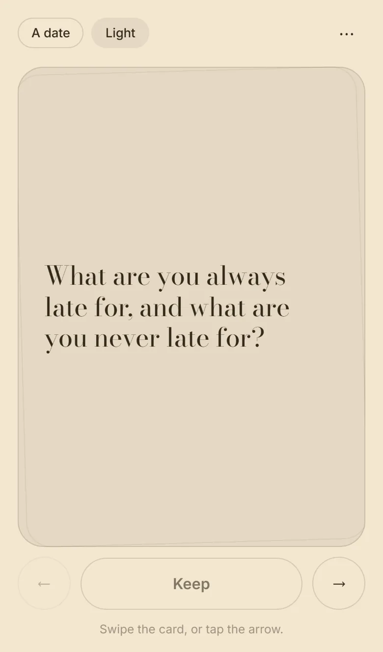
A cream screen: the pills read A date and Light, one large question on a card — What is the last thing you bought that you did not need? — with back, Keep and forward buttons.
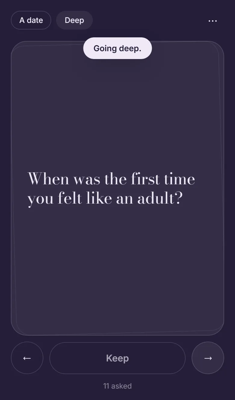
The same layout on a near-black violet field: the pill reads Deep, a toast says Going deep, and the question is When was the first time you felt like an adult? Eleven asked.
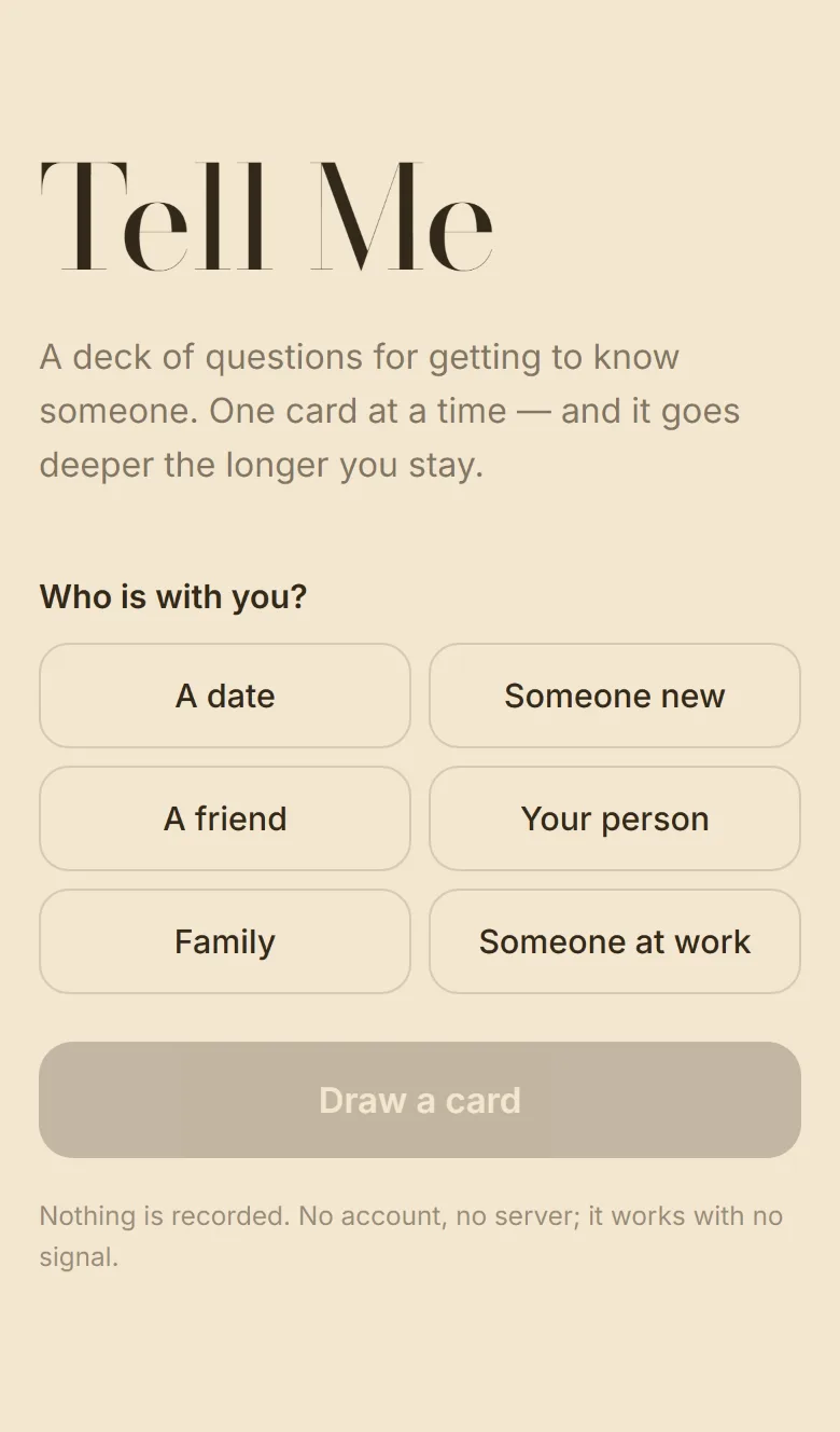
The opening screen: Tell Me in a large Bodoni, the line about going deeper the longer you stay, and six choices for who is with you.
Who is with you
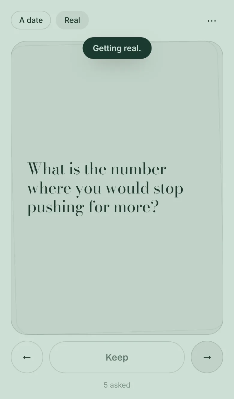
The middle depth on a sage green field, the pill reading Real, with a toast that says Getting real.
Four cards in, it gets real
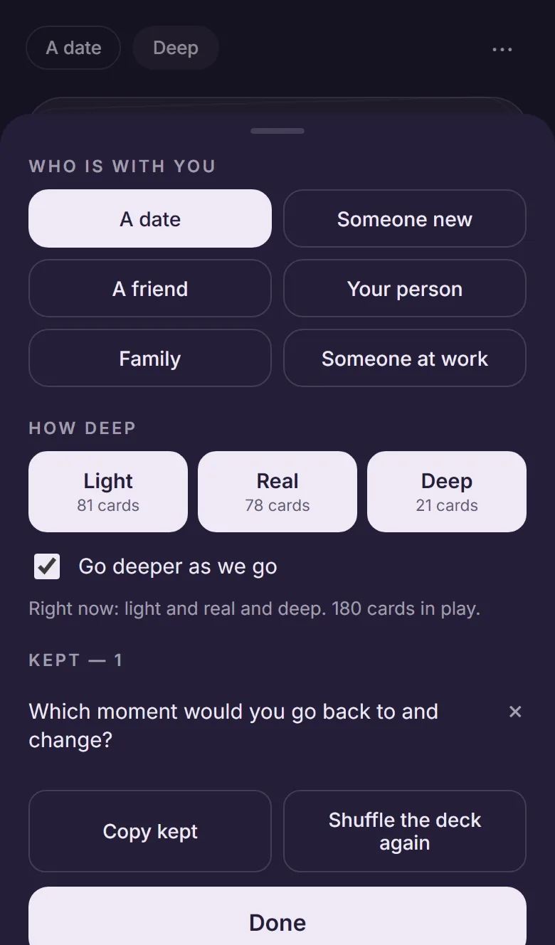
The settings sheet: who is with you, three depth tiles with card counts, a Go deeper as we go switch, and the kept list.
Or set the depth by hand

What it is

The one-to-one version of Closest: no game, no scoring, just a deck. Say who is with you, draw a card, swipe for the next. It is installable and works with no signal, which is the only way a thing like this survives an actual dinner.

The ramp is the whole idea. The first four cards are light. Then the real ones come into play. After ten, the deep ones do — and the whole screen changes colour with the depth, cream to sage to night, so a conversation getting more serious is something you can see rather than something anybody has to announce. It is the only progress bar the app has.

242 of Closest's cards carried over, keeping only the ones that work without a table of people. Someone at work gets no deep pile at all — 81 light and 57 real cards exist for that column and zero deep ones, so the app greys the tile out and says none for this rather than putting something regrettable on the screen.

242 cards · 3 depths · installable · nothing recorded

Cards242
Depths3
Who6
Taps to start2
Offlineyes
Built in1 session

Notes from the build

  • A transform that zooms the phone out. The card is dealt by sliding it to translateX(115%). That widened the document, and a mobile browser answers a wider document by zooming the layout out — innerWidth went from 390 to 809 mid-deal. The stage clips now, and the walkthrough samples scrollWidth every 30 ms during a deal so it cannot come back.
  • The ramp only counts if you can see it. The first version picked at random from the newly widened pool, so the card at the moment it was meant to deepen was often still a light one and the colour never changed. The card that crosses a boundary is now forced to come from the deeper pile.
  • "Getting real" twice is worse than never. The announcement re-fired every time a shallower card came round again. Each depth is now announced once, remembered across reloads, and the shallow mix dropped from 35% to 15% so the field stops flickering.
  • Three products, one bank. Closest, Tell Me and Questions For. all came out of idea #219 in a single sitting, and they are three different things: a game for a table, a deck for two people, and a reference for one person with a problem.
No. 09

Roomspace

Web · a room drawn from twelve numbers, a size and a purpose · five rules it is not allowed to set
“why not just create a interior design vector space. — rulesets — 60:30:10 ness / negative space rhythm / best practicalness (seating groups, etc...) / colorfulness / palette consistency / woodness / brassness / goldness / coziness / clean-ness / redness ... and so on” Idea #94 · rolled 4 Sep 2026 · extended the same day
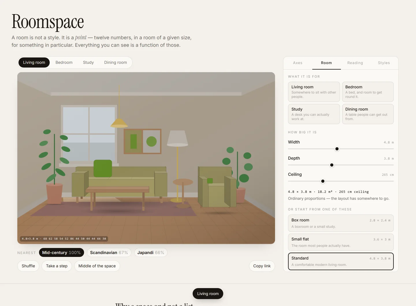
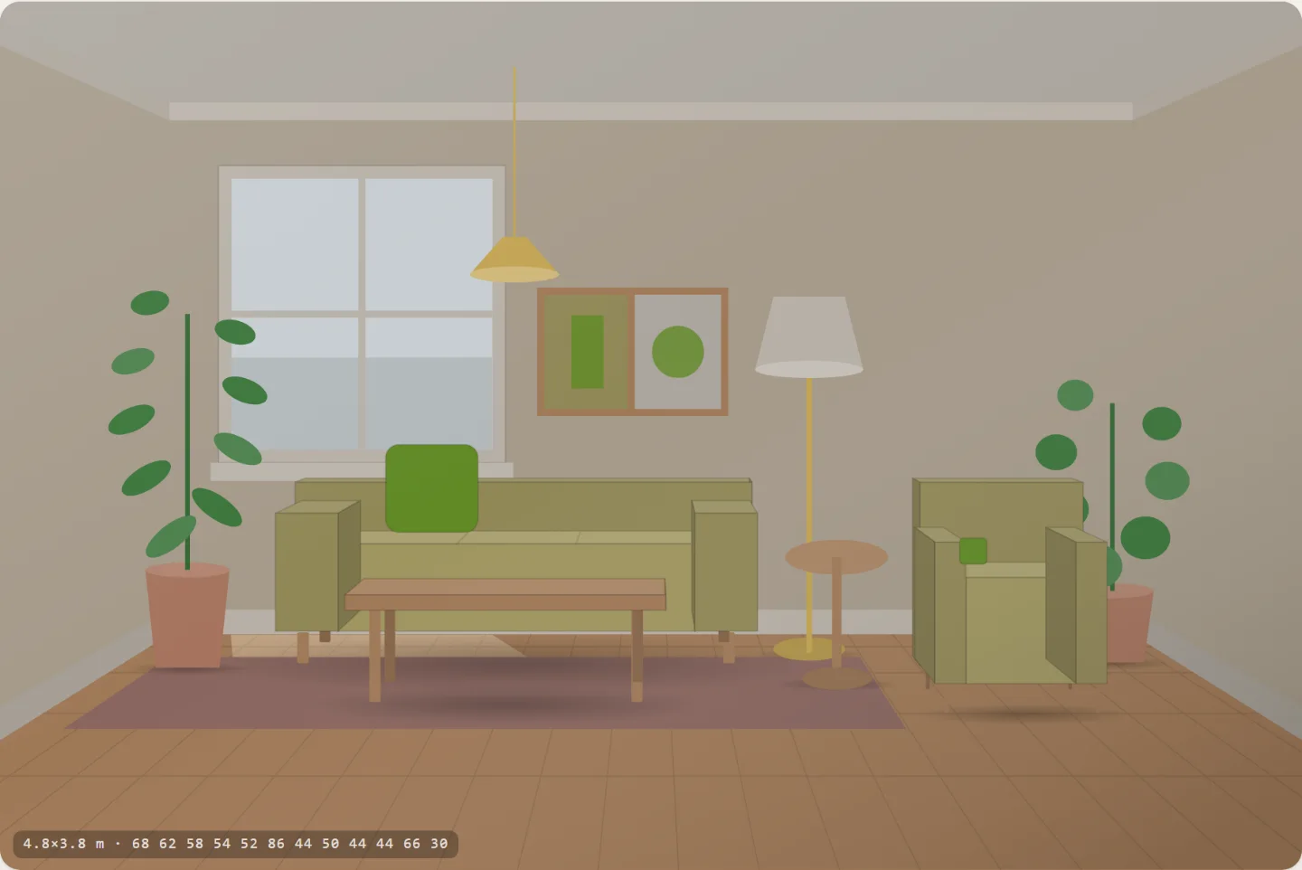
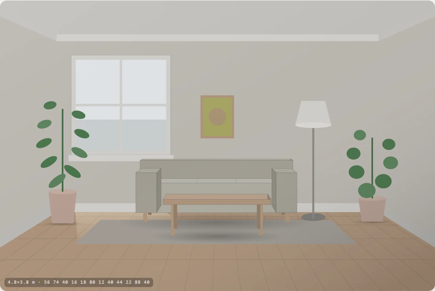
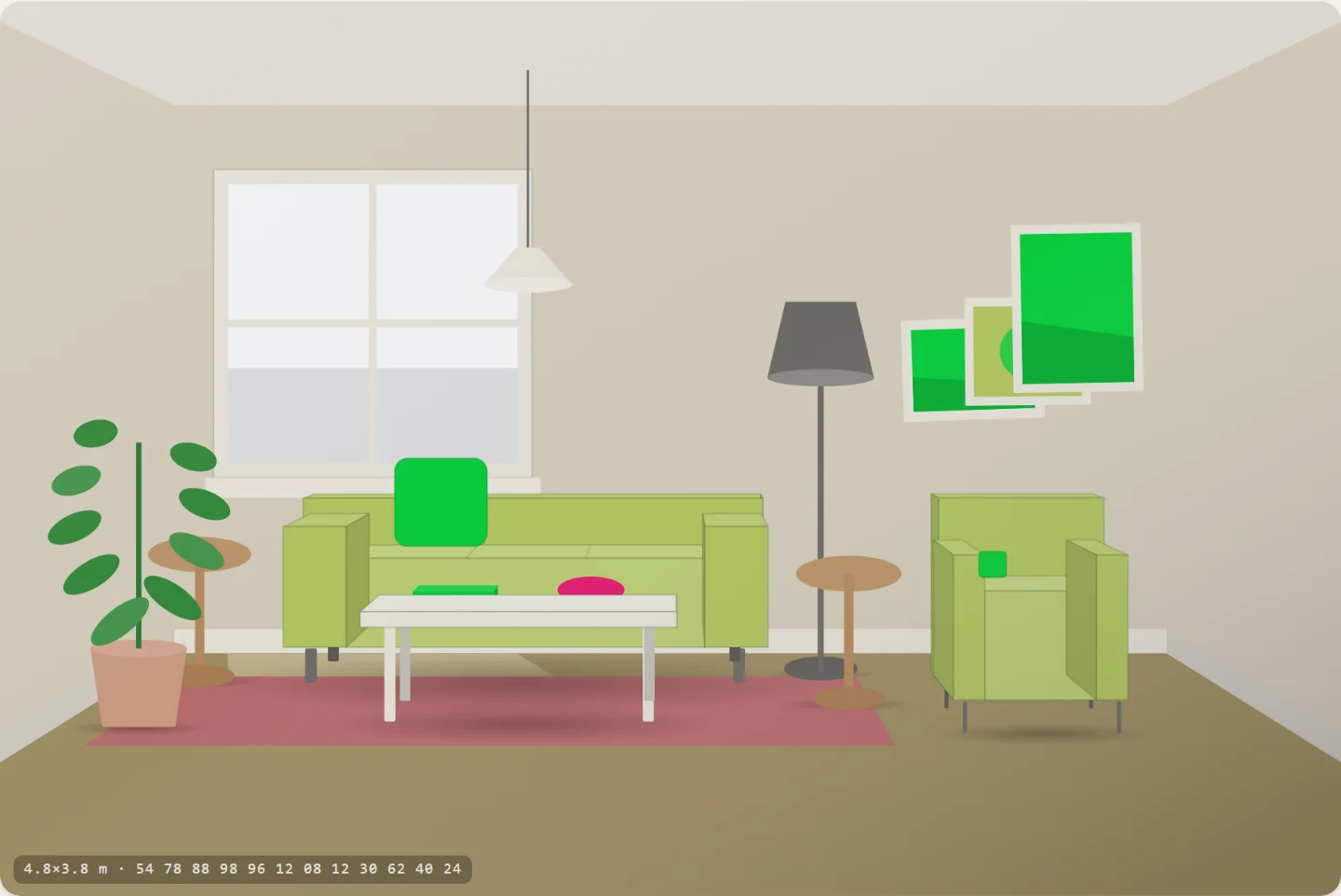
The app at desk width: a living room drawn in perspective with a window, sofa, coffee table, armchair and plants, a row of buttons above it reading Living room, Bedroom, Study, Dining room, and a panel on the right with room width, depth and ceiling sliders reading 4.8 by 3.8 metres, 18.2 square metres.
A living room: sofa, coffee table, armchair, side table, sideboard, floor lamp, two pictures.
Living room
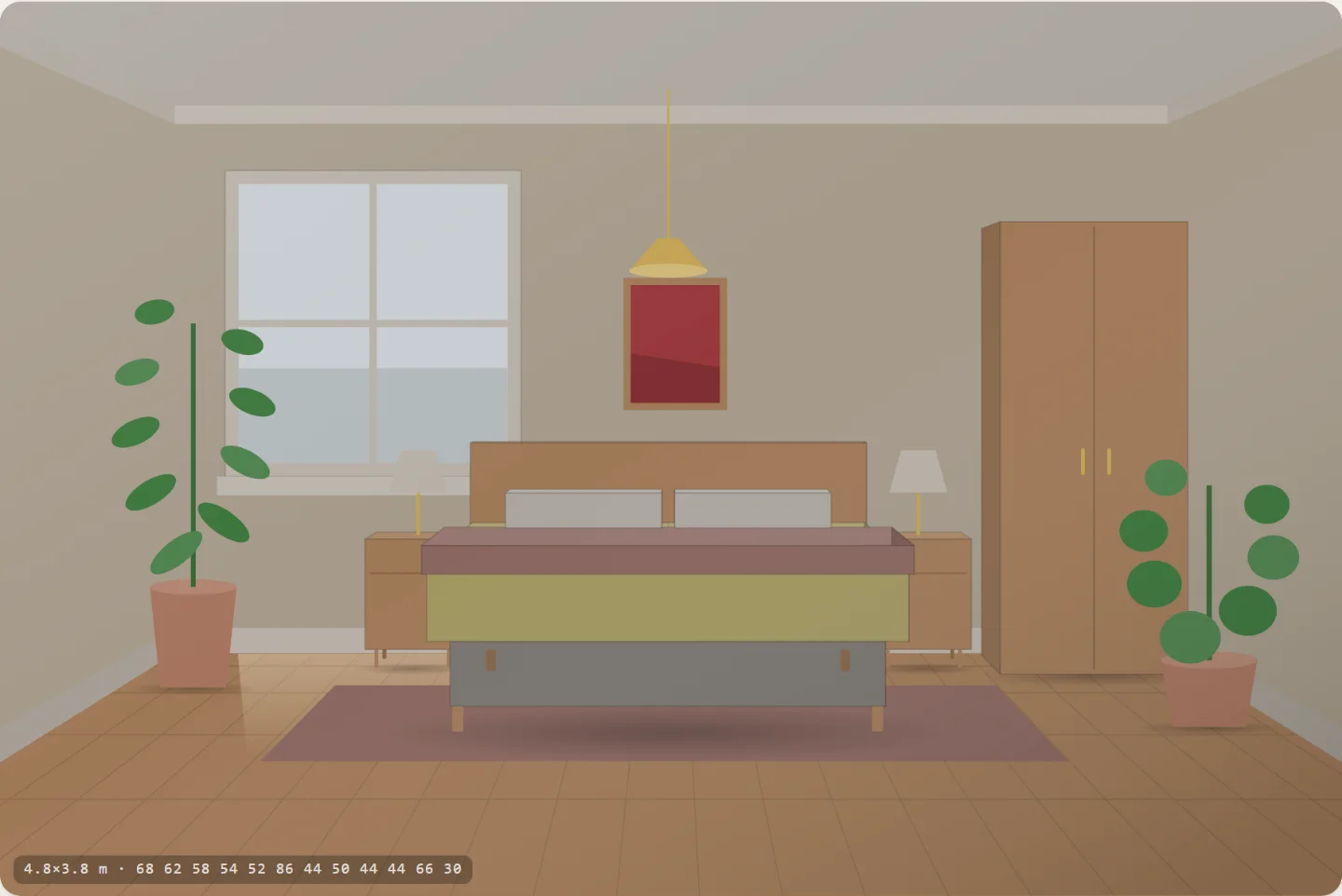
A bedroom: a double bed seen from the foot, a nightstand and lamp on each side, a wardrobe, a picture above the headboard.
Bedroom
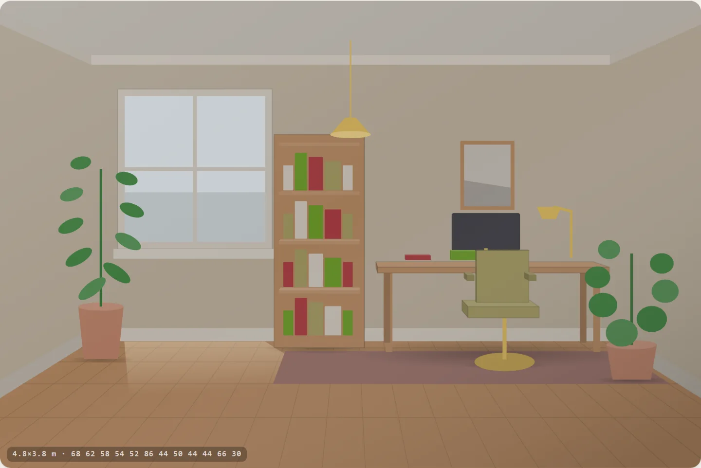
A study: a desk with a monitor and a task lamp, a desk chair seen from behind, a full bookcase, a picture on the free wall.
Study
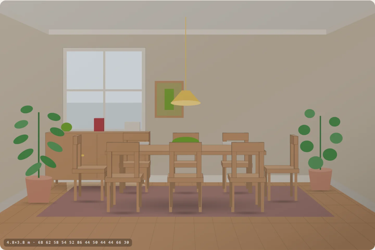
A dining room: a table with chairs on both sides and at each end, a pendant centred over it, a sideboard against the wall.
Dining room
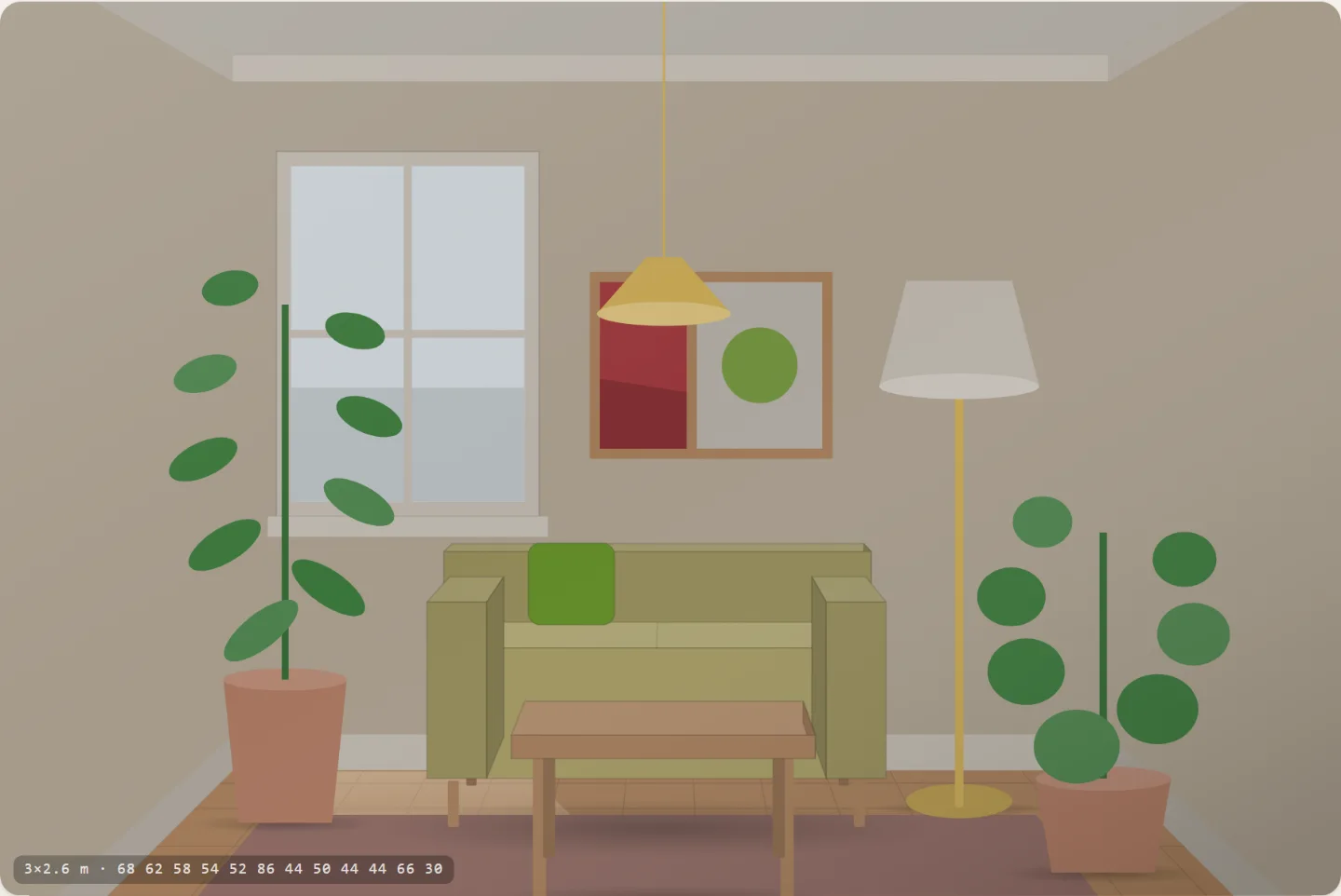
The same living room in a 3 by 2.6 metre room: the furniture fills the frame and the coffee table runs off the bottom edge.
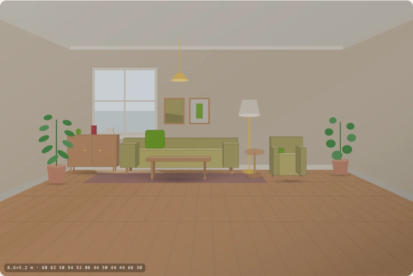
The same living room in a 6.6 by 5.2 metre room: the same furniture is a small cluster against the back wall with an expanse of empty floor in front of it.

Identical coordinates, identical furniture — 3.0 × 2.6 m and 6.6 × 5.2 m

What it is

The note is not a feature list, it is a coordinate system, so that is what got built. Twelve axes — warmth, light, contrast, colourfulness, hue range, woodness, brassness, greenery, coziness, stuff, cleanness, weight — and a room drawn live from them in one-point perspective. Nothing is a photograph and nothing is a preset.

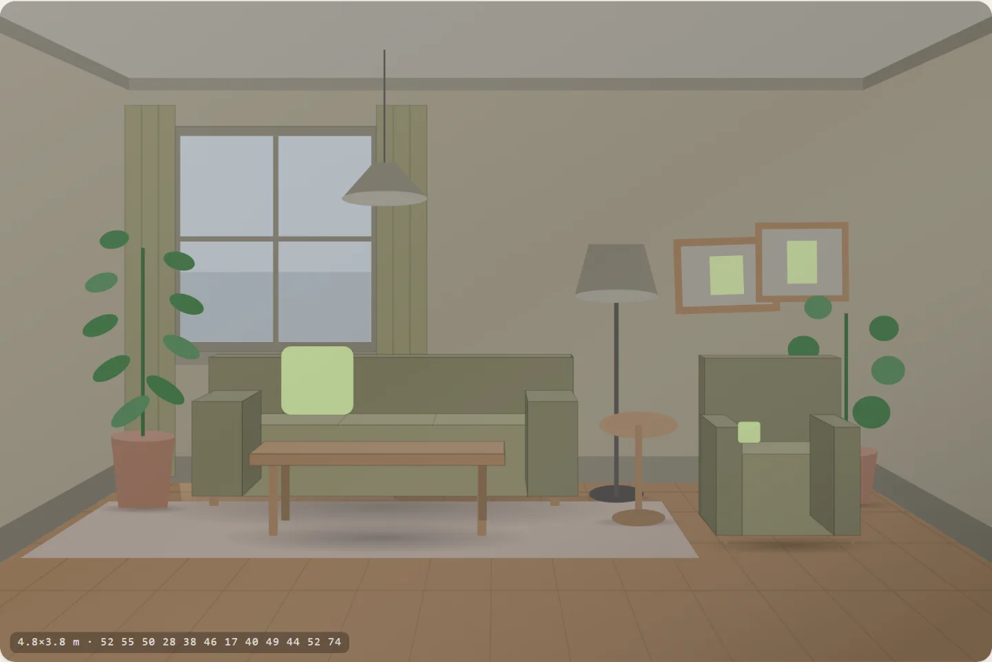
Two more inputs are deliberately not axes, because they are constraints rather than taste: how big the room is and what it is for. Size is what decides how much of the frame the back wall fills, so a small room reads as small — the two pictures above are the same coordinates and the same furniture at 7.8 m² and 34 m².

Five of the rulesets are not sliders. 60:30:10, negative space, palette consistency, value contrast and practicality are measured off the room after it is drawn — the colour rules from every fill in the SVG weighted by its area, the rest from the floor plan in centimetres. A rule you can dial to 100 tells you nothing. These are allowed to disagree with you.

12 axes · 4 purposes · 15 styles · 5 measured rules · no server

Axes12
Purposes4
Rules measured5
Styles as points15
A room, in bytes16
Built in1 session

Notes from the build

  • "Practical" is not one thing. A living room is wrong if you cannot reach a table from the sofa; a bedroom is wrong if somebody has to climb over somebody to get out; a study is wrong if the window is straight in front of the screen. So each purpose brings its own checks — 60 cm on both sides of a double bed, 90 cm behind a desk chair to stand up, 90 cm to pull a dining chair out and walk behind it — and the reading names the distance that is wrong.
  • Half the failures were the planner's fault, not the room's. The armchair failed its own "something within reach" check in every room, because a sofa centred on the wall with a chair bolted to one end leaves nowhere between them for a table. The desk landed in front of the window and then complained about glare. Both are fixed where they belong — in the layout, not in the check.
  • A measure that moves the wrong way is worse than none. Value contrast was read off colour families, and which family a surface lands in flips as its lightness crosses a bucket edge — so turning contrast down could push the number up. It is now area-weighted straight off the shapes: the darkest quarter of the picture against the lightest.
  • Styles are coordinates, not categories. Which means the app can say you are 71% of the way to Japandi, and it can put you halfway between Brutalist and Cottage — a real room you can look at. A list of styles has no halfway.
  • Warmth is not a rotation of the colour wheel. Interpolating blue to red the short way runs through green at the midpoint, so every "warm" room came out olive. It is anchored now through the range interiors actually use: cold blue, blue-grey, sage, oat, tan, terracotta.

Same numbers, different rooms

A pale warm room: oat wall, oak floor, one small framed picture, a sage sofa and two plants.
Japandi
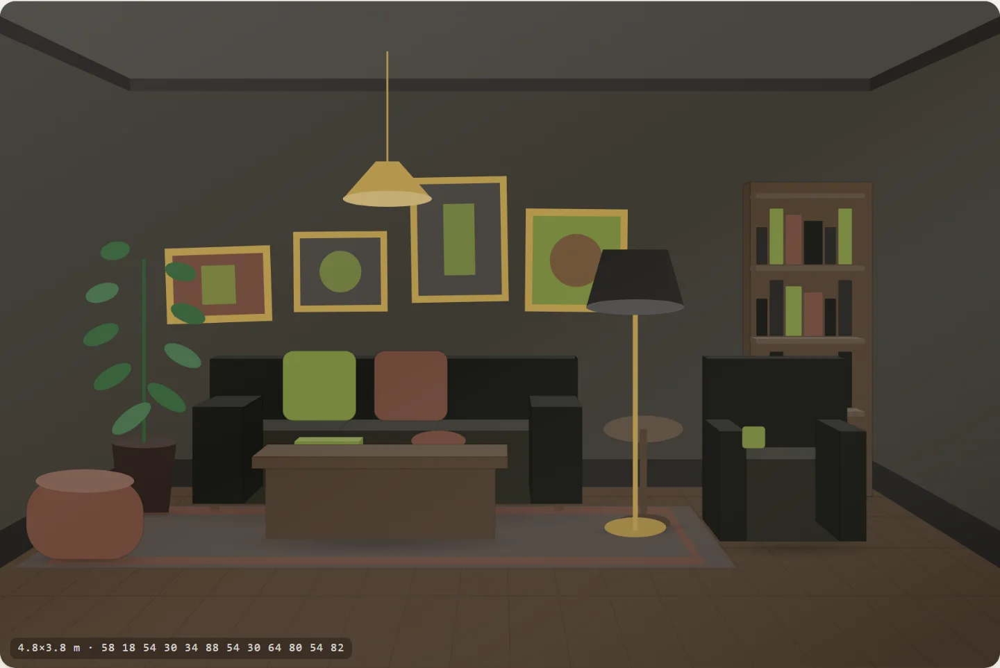
A near-black room: gold frames, a full bookcase, a dark sofa and a brass lamp.
Dark academia
A bright room with saturated pink and turquoise blocks and no wood anywhere.
Memphis
A muted heavy room with a low grounded sofa and a plain rug — the midpoint of two named styles.
Brutalist × Cottage
No. 10

Squint

Web app · a screenshot goes in, measurements come out · no model, no server, nothing uploaded
“UI AI — just like computer vision, it requires wholly different models: detect paddings, detect margins, detect fint (sizes), detect colors, detect blocking / areas, detect visual flow ... and so on” Idea #149 · rolled 5 Sep 2026
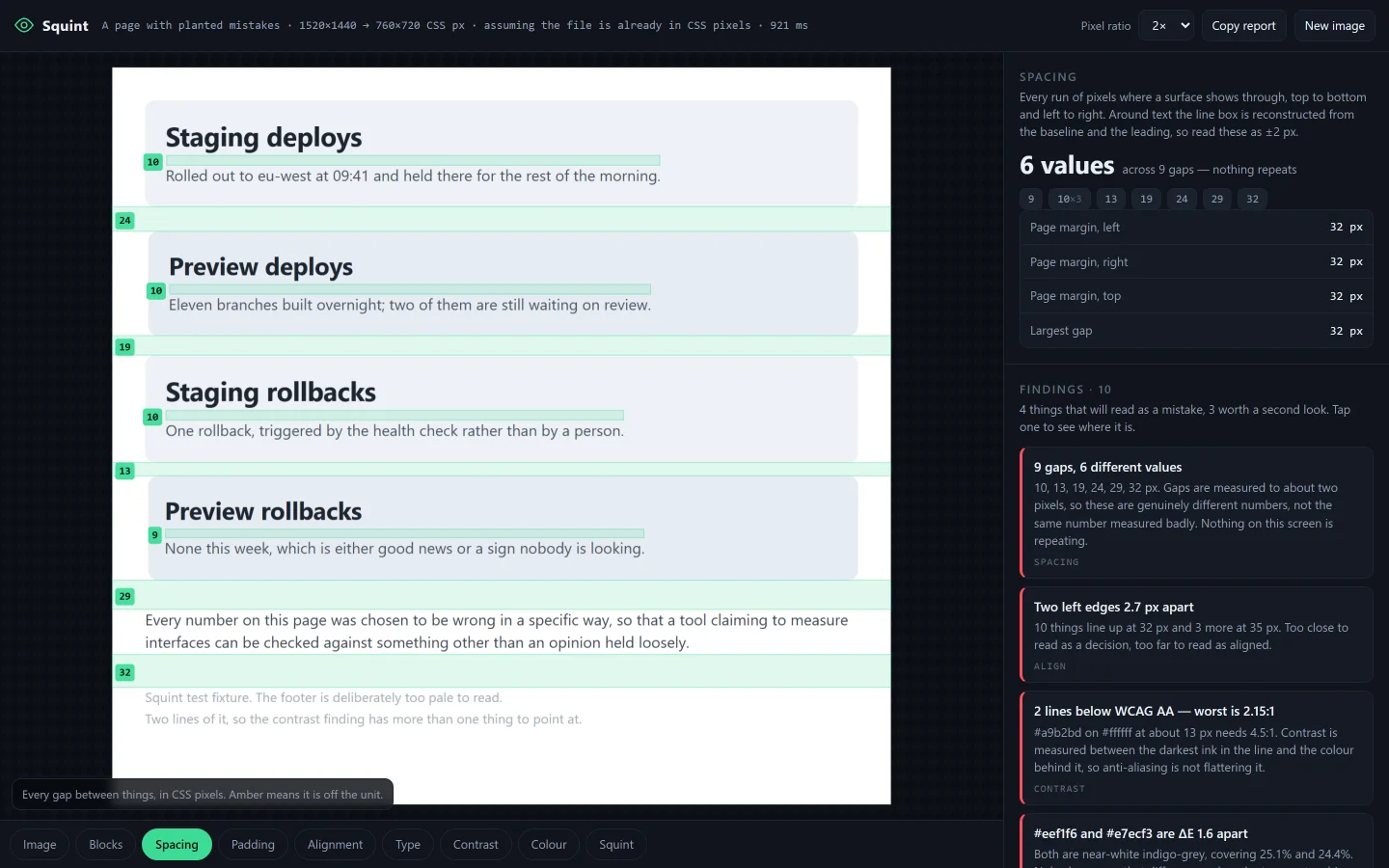
The app: a screenshot of a settings page on the left with green bands drawn across every gap and the size of each one labelled in pixels, and a panel on the right reading 6 values across 9 gaps — nothing repeats, followed by a list of findings.
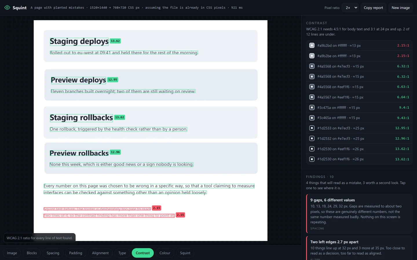
Every line of text boxed, each labelled with its WCAG contrast ratio; two failing lines are boxed in red.
Contrast, per line
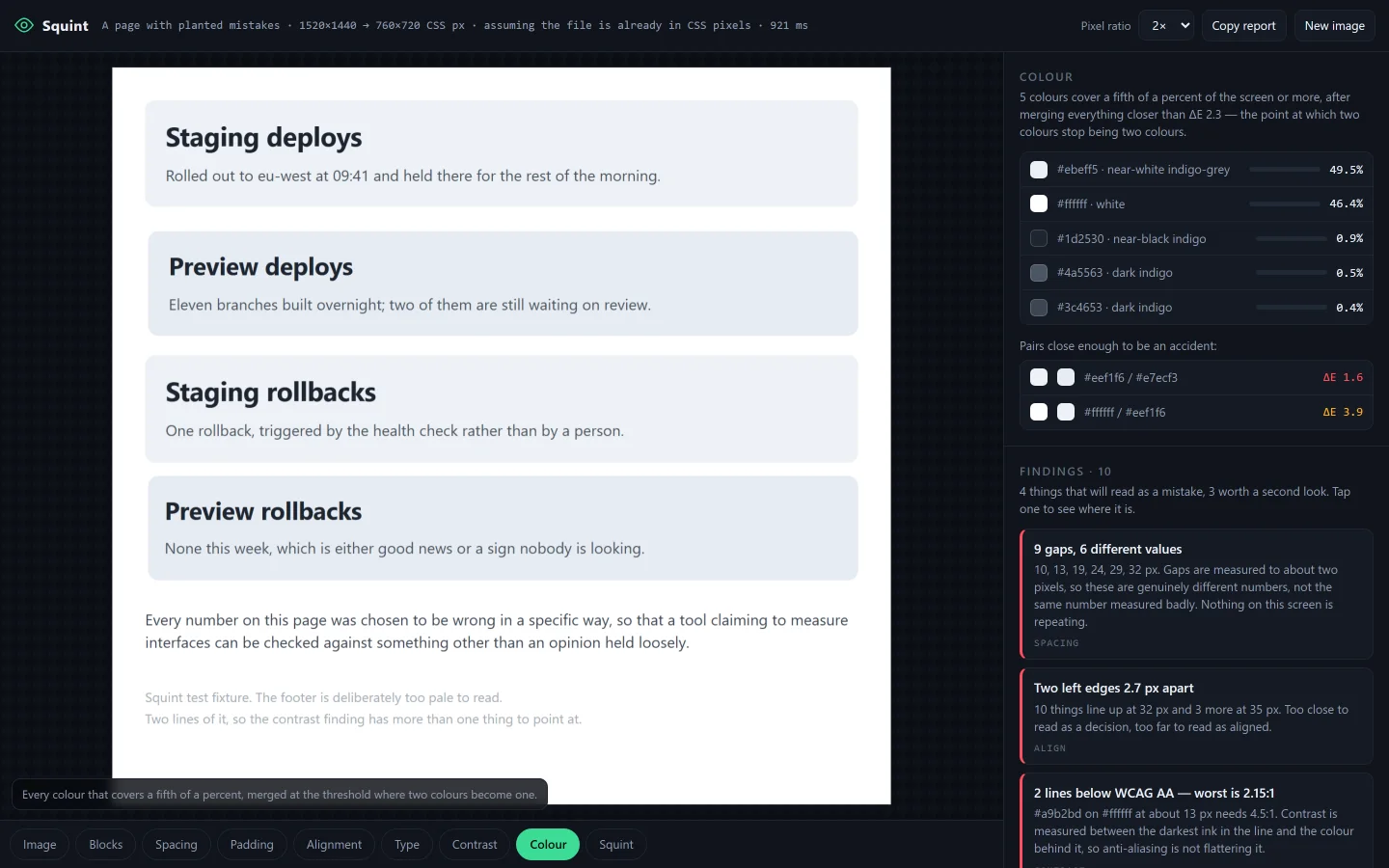
A list of every colour on the screen with its hex, a name, and the share of the screen it covers, plus a pair flagged as 1.6 delta-E apart.
Colours you can tell apart
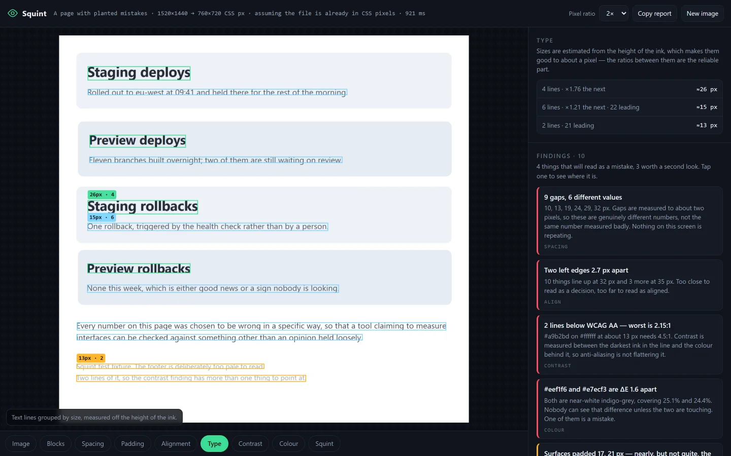
Each line of text boxed and colour-coded by size, labelled with an estimated pixel size and how many lines share it.
The type scale
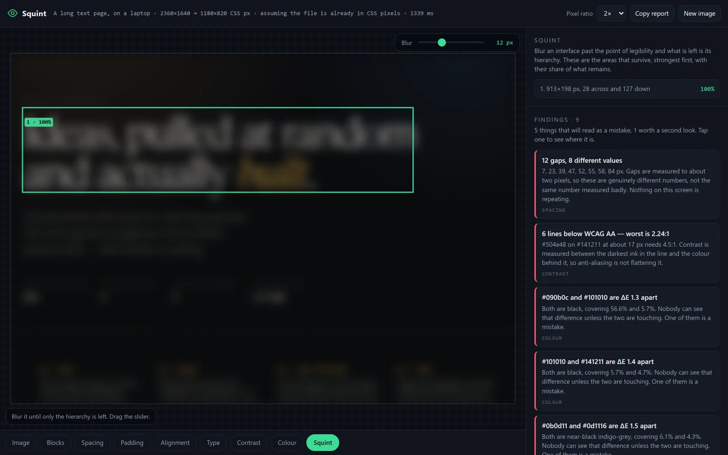
The screenshot blurred past legibility with numbered boxes around the areas that still stand out, ranked by strength.
The squint test

What it is

The note asks for models. None of it needs one — paddings, margins, sizes, colours, areas are all things you can measure, and the reason nobody measures them is that the screenshot has thrown away the DOM, not that the problem is hard. So: drop in a screenshot, and Squint takes it apart in about a fifth of a second, in the browser, with the image never leaving the tab.

Nine layers drawn over the picture — blocks, spacing, padding, alignment, type, contrast, colour, and a squint test that blurs the screen until only the hierarchy is left. Every number is in the CSS pixels of the original interface, which is the number in somebody's stylesheet, not the number in the file. A phone screenshot is three device pixels to one, so getting that wrong makes an 8 px grid look like a 24 px one.

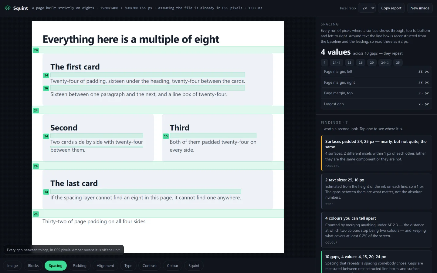
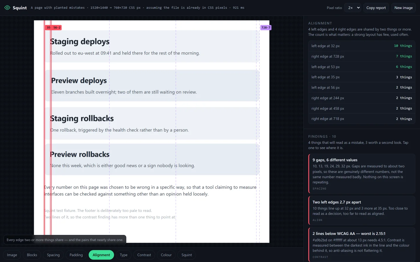
Two fixture pages, not one. One has mistakes planted in it — an off-grid gap, a 3 px misalignment, two card colours ΔE 1.6 apart, a footer at 2.19:1 — and the walkthrough asserts each one is found. The other is built strictly on eights and has nothing wrong with it at all. Half the work went into the second, because it is very easy to build something that finds faults everywhere.

9 layers · 46 assertions · 0 dependencies · 0 bytes uploaded

Layers9
Fixtures2
Measured inCSS px
Time to measure~0.2 s
Leaves the tabnothing
Built in1 session

Notes from the build

  • The most common colour is not the background. Cover more than half a screen in cards and the cards become "the page", white becomes content, and every reading after that is inside out — margins of zero, no gaps between anything. The page is whatever the frame is resting on, so it is taken from the border ring instead.
  • Ink-to-ink is not a gap. The same 12 px margin measures 16, 17 or 18 depending on whether the heading above it happens to contain a descender. Line boxes have to be rebuilt: baseline from where the x-height band ends, leading from the tightest baseline-to-baseline step, box from the em box centred in it. Without that pass a design built strictly on eights measures as noise.
  • A tolerance that cannot fail is not a measurement. Gaps come out good to about two pixels, and at ±2 a 3 px grid matches nearly every integer there is — so it would always "fit". The headline is not the unit at all now. It is whether the numbers repeat: four values across ten gaps is a scale, ten values across ten gaps is ten separate decisions.
  • Ragged text has no right edge. Measuring padding-right from the longest line is how you end up telling somebody their card is padded 229 px on one side. Only something that is not a line of type can certify that side; without one the honest answer is that it cannot be measured, and that is what it says.
  • Lossy screenshots invent colours. A ΔE of 1.3 between two darks in a WebP is the encoder's opinion, not the designer's. Squint counts how many colours hold real area; past a few hundred it says the file has been compressed and downgrades those findings rather than blaming the person who made the screen.

The control, and the patient

The app on a page built entirely on multiples of eight; the panel reads four values across ten gaps and the finding is marked good.
Built on eights — “4 values, they repeat”
Vertical lines drawn down every shared edge, with two of them in red three pixels apart.
Two left edges, 2.7 px apart
Next roll pending. Ten built, 218 still sitting in the hub.