01
Editorial
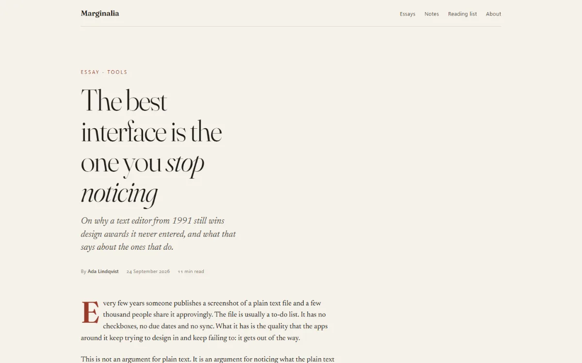
Serif long-form: 66ch measure, drop cap, pull quote, margin notes that fold under the text on a phone.
for: essays, docs, changelogs with opinionsShells · thirty empty designs
Each shell is one HTML file with no scripts and no build: colour and type tokens on :root, a dark set under prefers-color-scheme, Google Fonts only, 16px gutters on a phone, and placeholder content that reads like a real product. Copy the file, keep the tokens, replace the words.
Serif long-form: 66ch measure, drop cap, pull quote, margin notes that fold under the text on a phone.
for: essays, docs, changelogs with opinions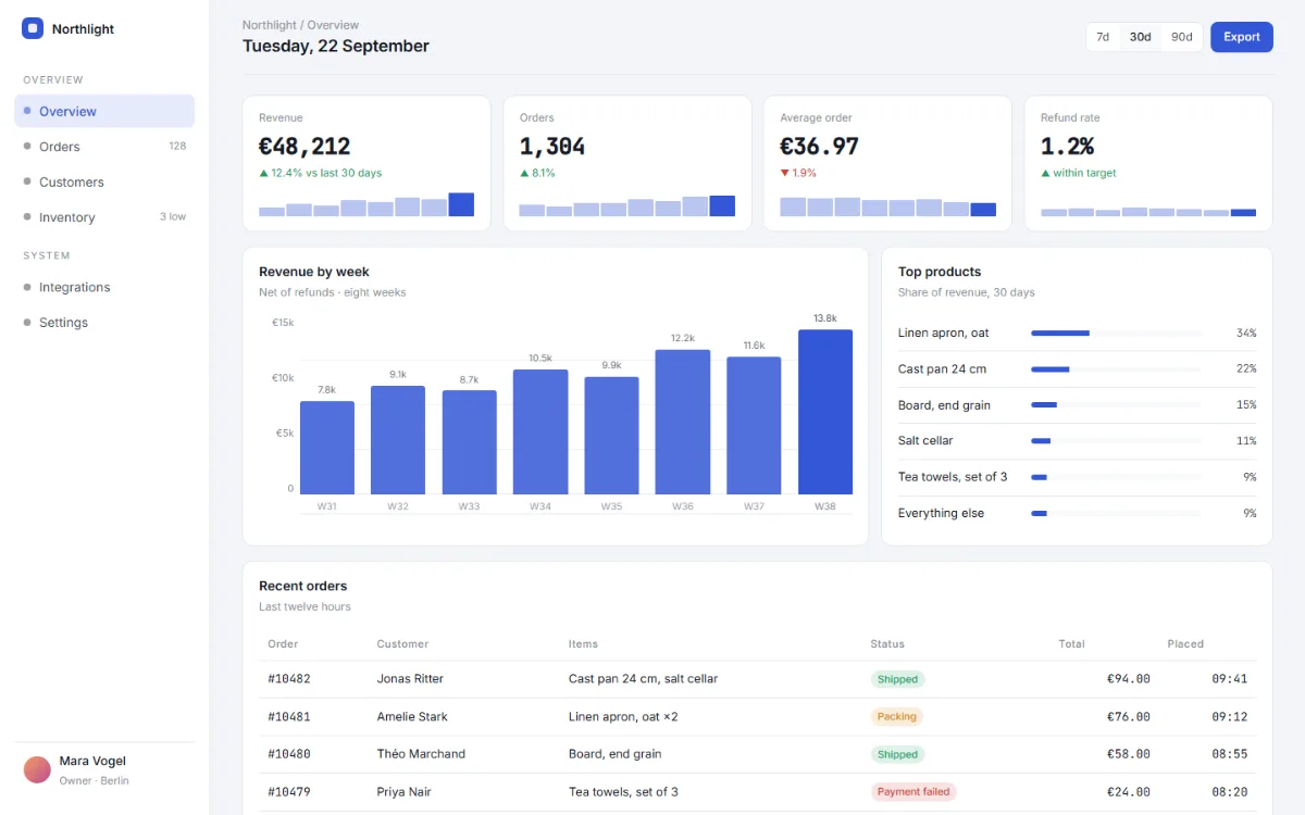
Sidebar that becomes a top strip, stat tiles with sparklines, a chart drawn with divs, an activity table.
for: admin screens, analytics, the home of a tool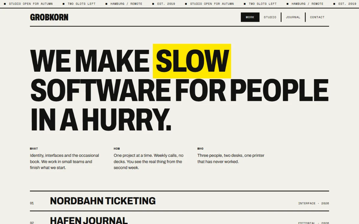
Thick rules, one accent used as a block, condensed grotesk at poster size, a grid that shows its bones.
for: studio sites, zines, manifestos, loud tools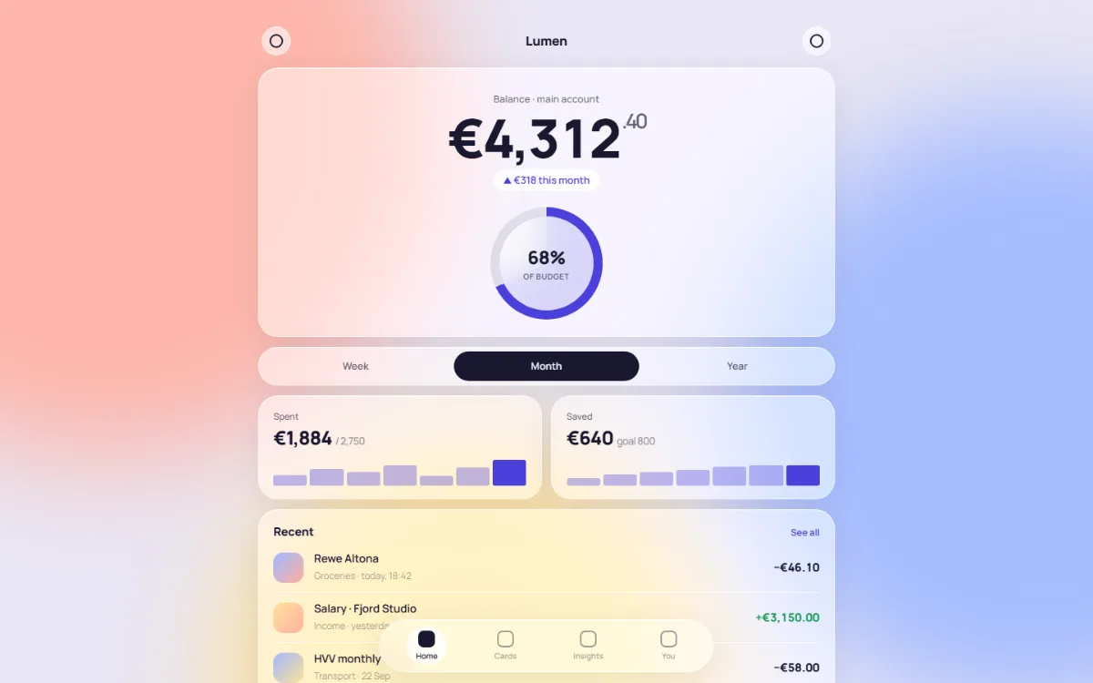
Frosted panels over slow colour blobs, one big number, a conic ring, pill controls, a floating tab bar.
for: wallets, players, health and weather views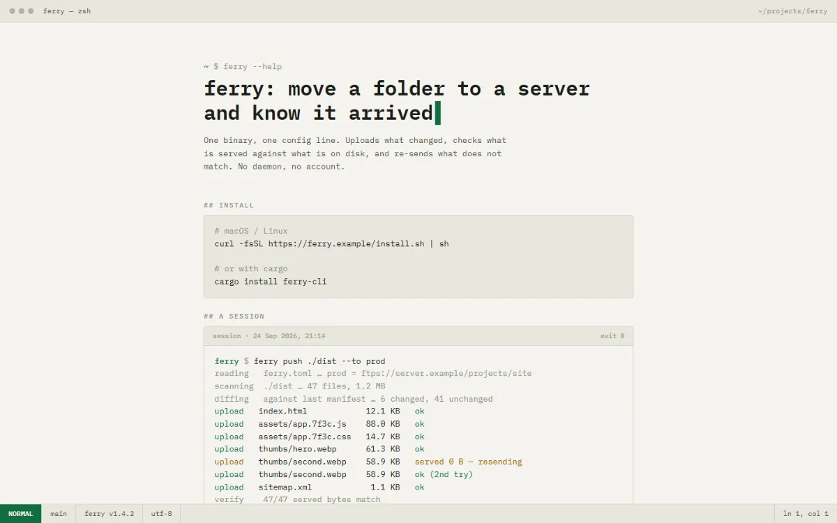
Monospace grid, prompt-styled header, a session transcript, a flag table and a status bar. Phosphor green by night.
for: CLI tools, logs, status pages, changelogs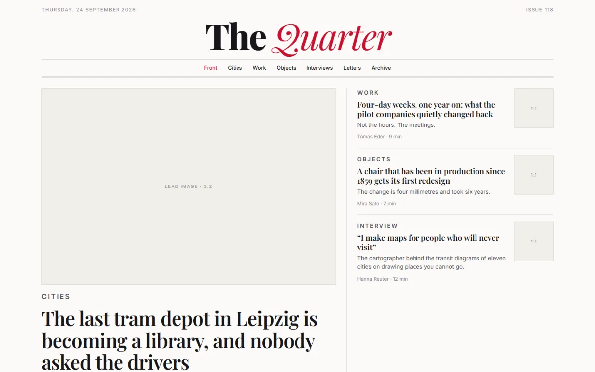
Twelve columns: lead story, secondaries with thumbnails, a shorts column, a most-read rail, an archive box.
for: publications, newsletter archives, link blogs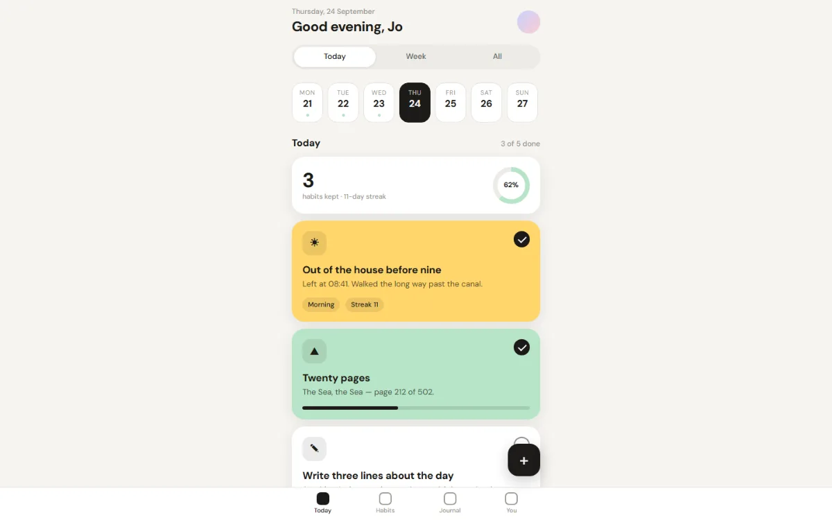
One phone-width column: sticky header, segmented control, a day strip, colour cards with progress, a FAB and a tab bar.
for: habits, notes, tasks, queues, decks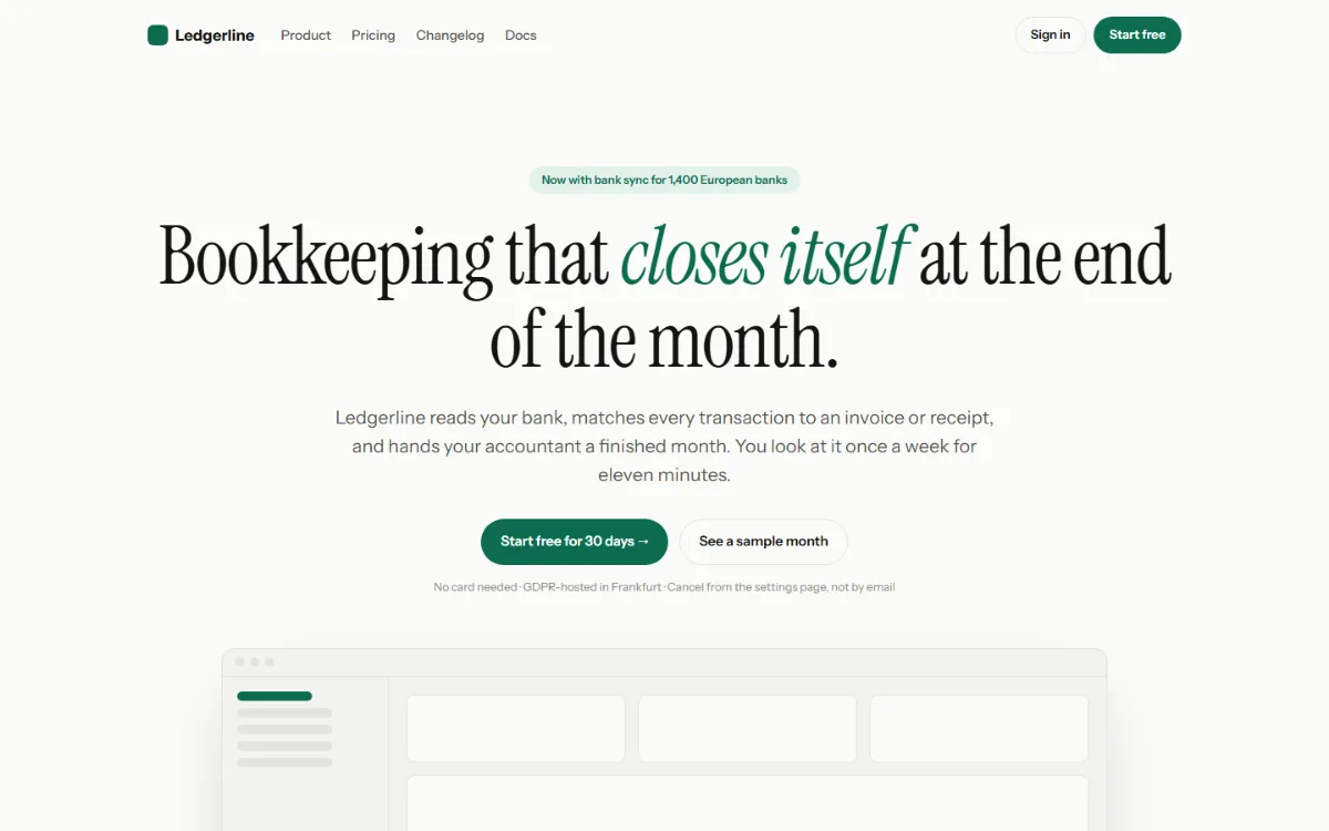
Hero, logo strip, three features, a quote, two prices, a CTA band, footer. Every section deletes cleanly.
for: the front page of a product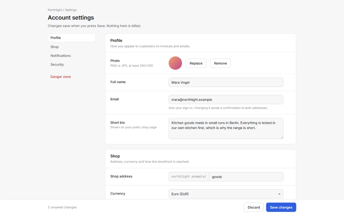
Section rail, label + control rows, native inputs styled once, a CSS toggle switch, a danger zone, a sticky save bar.
for: preferences, onboarding, checkout, edit views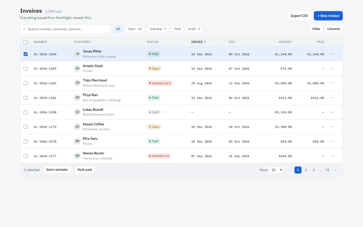
Toolbar, sticky-header table, row selection, status pills, tabular figures, pagination. Rows become cards on a phone.
for: invoices, users, logs, jobs, files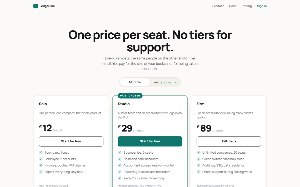
Three tiers, a CSS-only monthly/yearly switch, a feature comparison table, an FAQ in details/summary, a closing band.
for: the page that says what it costs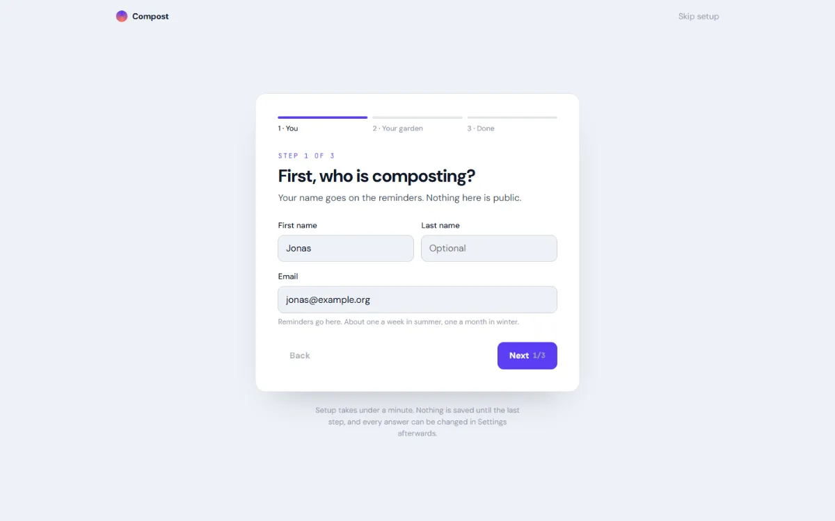
A three-step wizard with no script: radios hold the step, :checked picks the panel and the stepper state, Back and Next are labels.
for: first-run setup, sign-up, a short survey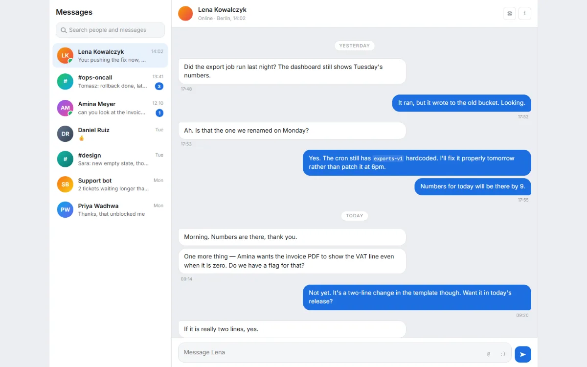
Conversation list, thread with bubbles for both sides, day dividers, an attachment, a CSS typing indicator, a pinned composer.
for: support inboxes, DMs, team chat, assistants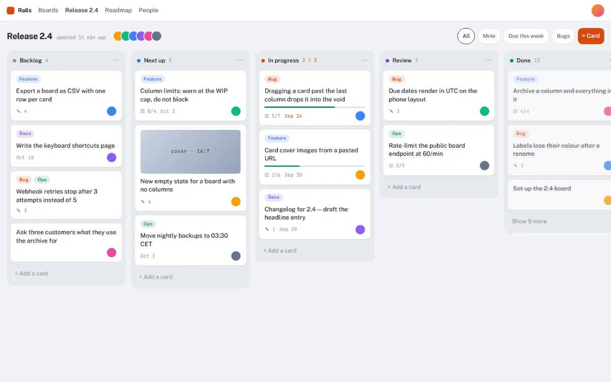
Filter chips, columns that scroll sideways inside the board, cards with labels, progress bars, due dates and a WIP limit.
for: tasks, pipelines, content plans, deals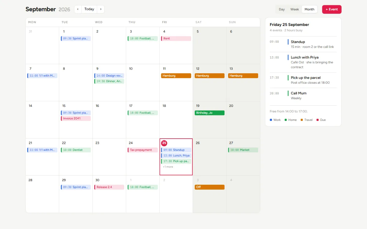
Month grid with leading and trailing days, event bars, a today marker, an agenda rail. Events become dots on a phone.
for: bookings, team calendars, content plans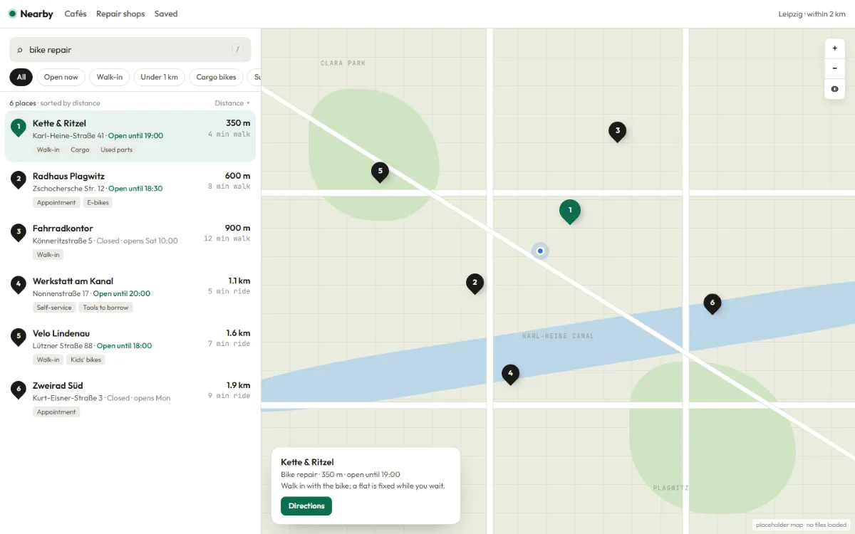
Search, filter chips and a results list beside a map drawn with CSS: roads, a river, parks, numbered pins. Swap in real tiles later.
for: store finders, directories, apartments, trails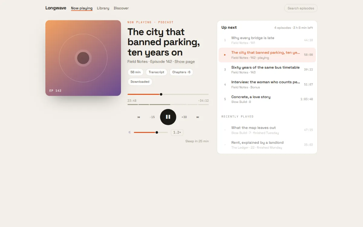
Cover art, scrubber and volume as styled range inputs, chapter marks, transport controls, a queue with the current track marked.
for: podcasts, music, audiobooks, lecture archives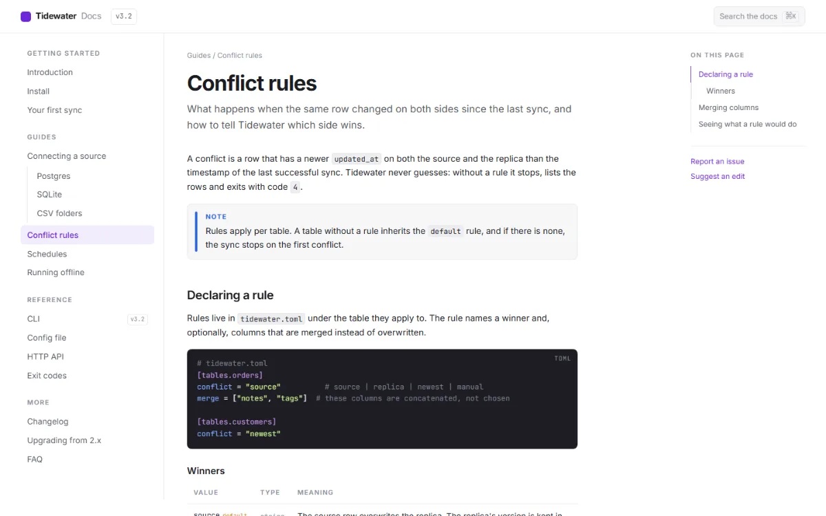
Nav tree with the current page marked, reading column with code, callouts and a parameter table, on-this-page rail, prev/next.
for: product docs, API references, handbooks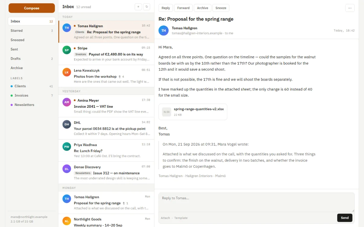
Three panes: folders, a message list with unread weight, a reading pane with a reply box. Folders become chips, then the list stands alone.
for: email, tickets, notifications, review queues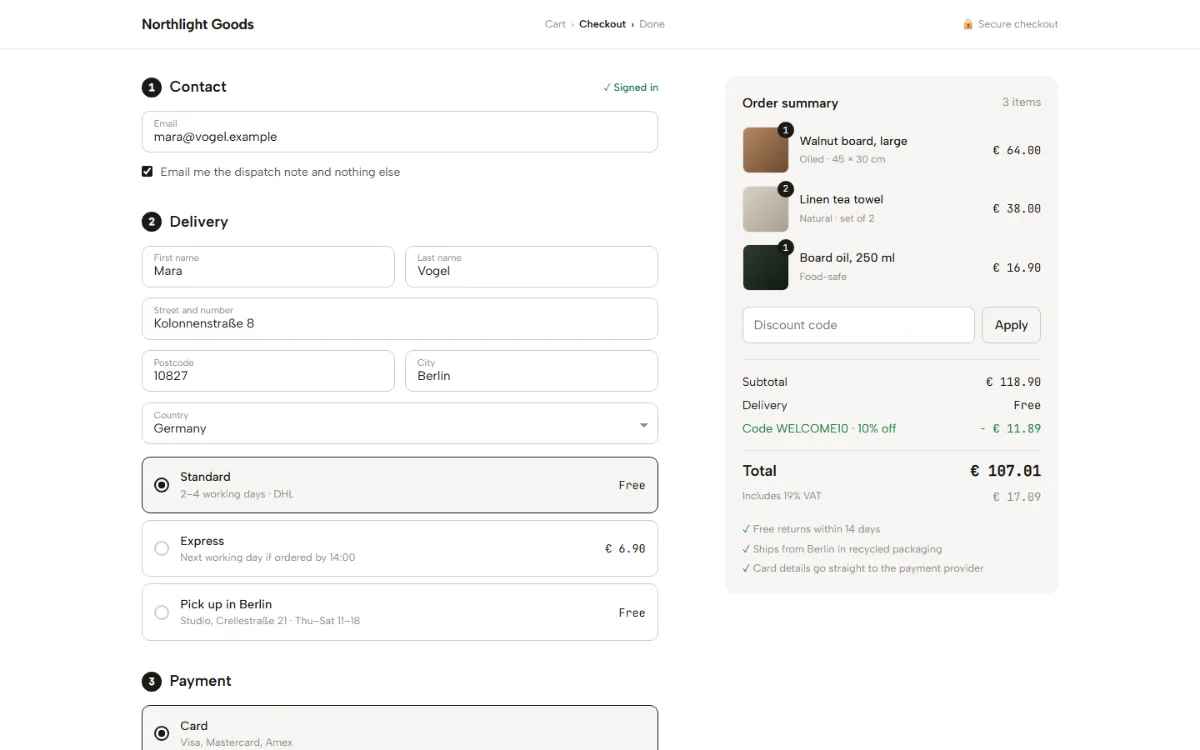
Contact, delivery and payment sections, floating labels, CSS-only choice cards that open, a sticky summary that folds into details on a phone.
for: shops, subscriptions, bookings, donations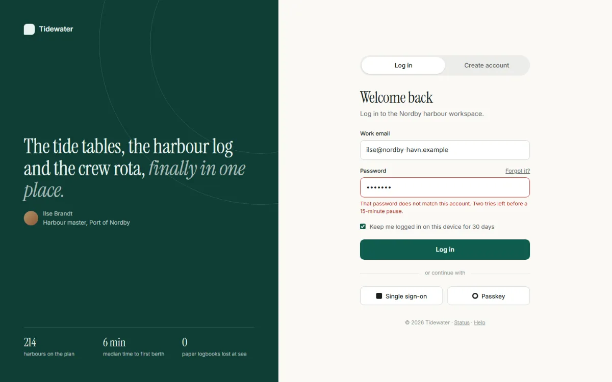
Brand panel with one quote, a CSS-only switch between log in and create account, an error state, a strength meter, SSO buttons.
for: log in, sign up, password reset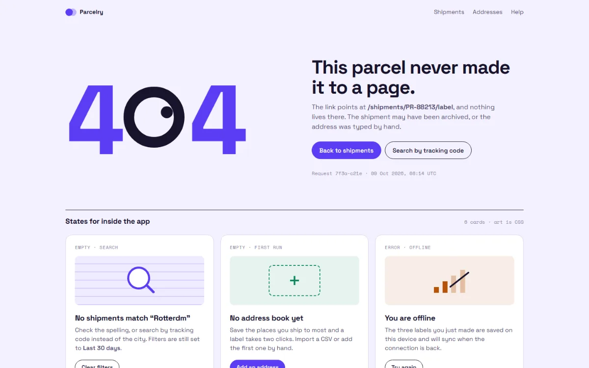
A 404 hero and six state cards: no results, first run, offline, no access, server error, maintenance. Every illustration is CSS.
for: 404s, empty lists, offline and maintenance screens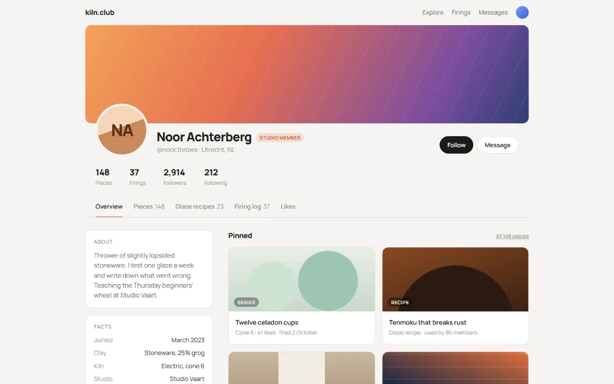
Cover, overlapping avatar, stats, tabs, an about rail and a feed of pinned work and recent activity. The rail goes on top on a phone.
for: member profiles, author pages, portfolios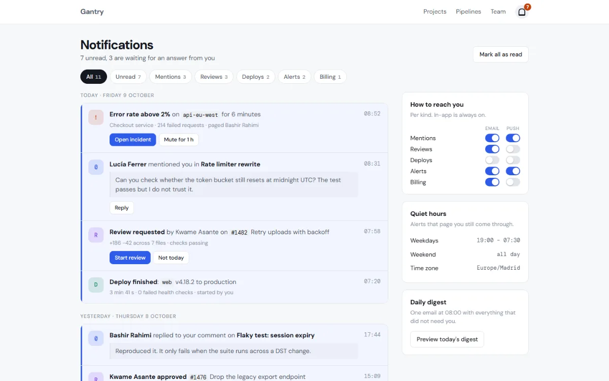
Day groups, unread tint and bar, an icon tile per kind, inline actions, and a preferences rail with CSS toggles and quiet hours.
for: activity feeds, notification centres, audit trails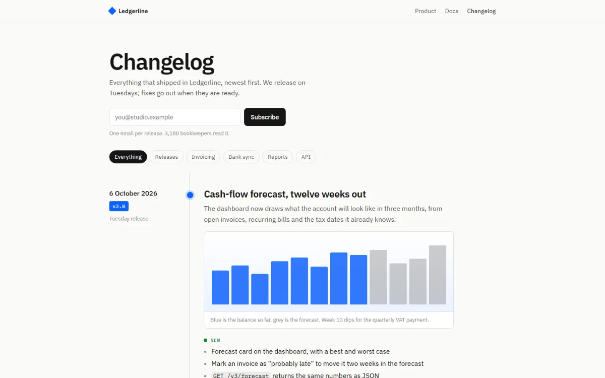
Sticky dates and version tags, a vertical rule with a dot per release, entries with labelled New / Improved / Fixed lists and a figure.
for: release notes, changelogs, project timelines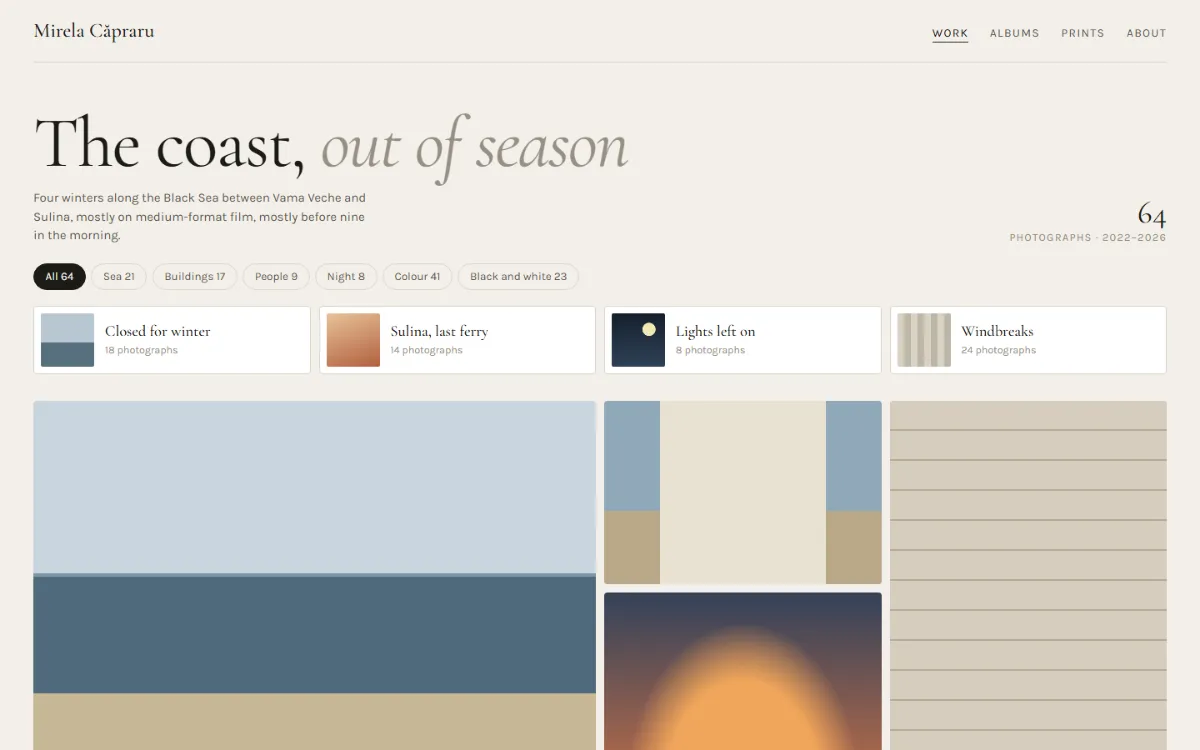
Dense grid with wide and tall tiles, hover captions that stay visible on a phone, an album strip, filters. Placeholders are gradients.
for: portfolios, albums, lookbooks, collections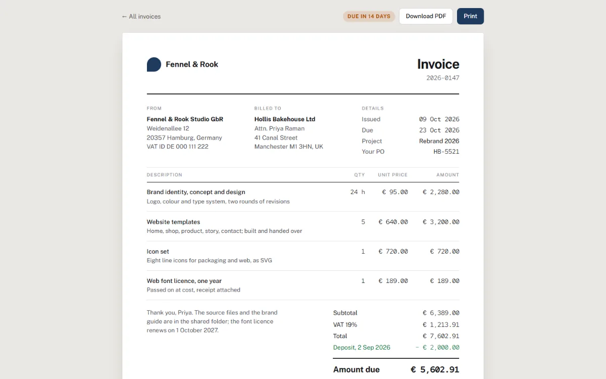
A sheet with parties, line items, totals, payment details and terms; an A4 print stylesheet; rows become labelled blocks on a phone.
for: invoices, receipts, quotes, order confirmations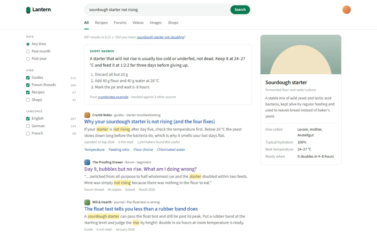
Sticky query bar and tabs, filter rail, answer box, results with marked snippets, related questions as details, pagination, info panel.
for: site search, knowledge bases, catalogues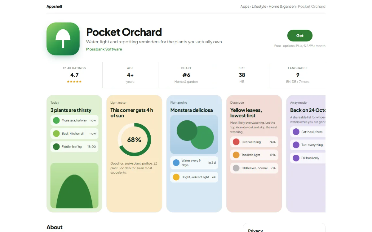
Icon, pitch and Get button, facts strip, CSS phone screenshots that scroll sideways, what’s new, ratings histogram, a sticky Get bar on a phone.
for: app listings, download pages, extension pages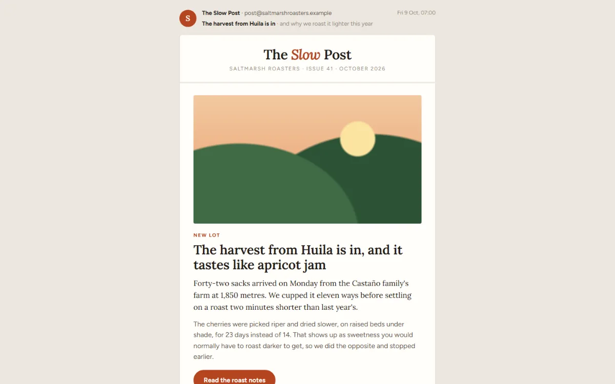
A 600px letter with no tables: masthead, hero story, two-up blocks that wrap, numbers band, product block, footer with unsubscribe.
for: newsletters, product updates, digests